PROJECT: 'SAVE THE SOUND' BIOSWALE ILLUSTRATIONS
CLIENT: CONNECTICUT FUND FOR THE ENVIRONMENT
Connecticut Fund for the Environment (CFE) are a not-for-profit environmental organisation. As part of their bi-state program Save the Sound they are working to protect and improve the land, air, and water of Connecticut and Long Island Sound to benefit the environment for current and future generations.
OBJECTIVE
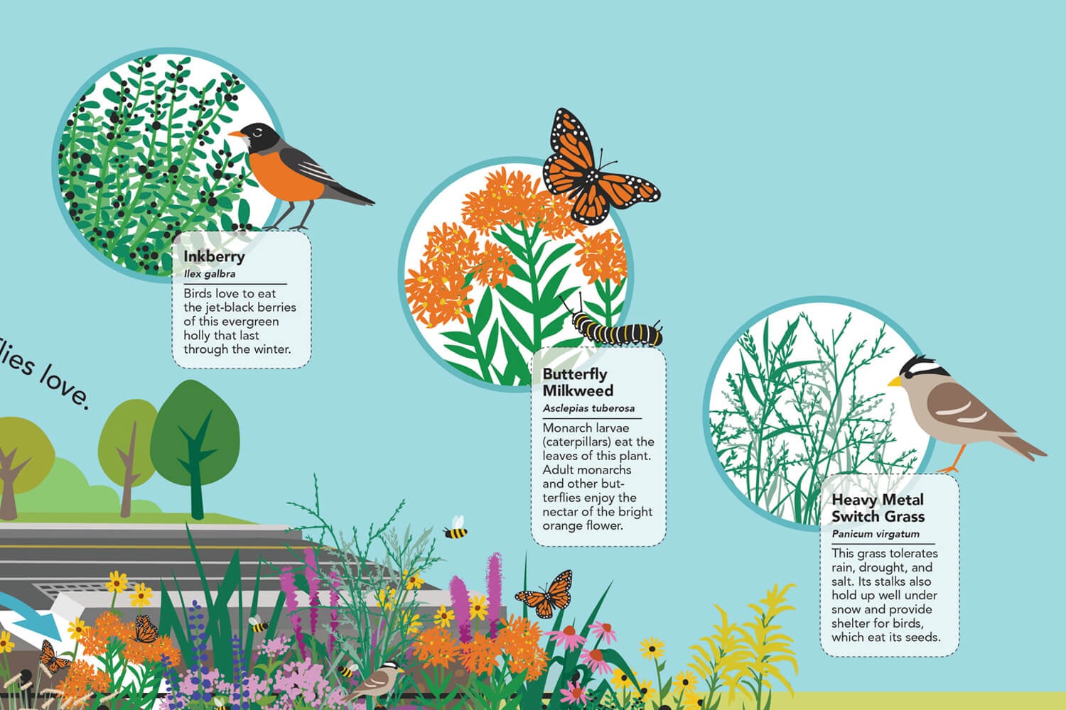
To create illustrations for an interpretive sign which will explain the benefits of a bioswale that CFE have installed outside a school in their community. The sign will be located next to the bioswale and the audience to be addressed are the children in the school, their parents and the local residents in the neighbourhood surrounding the school.
I worked with Tracy Stora, a freelance art director based in the Greater New York City area to complete the project.


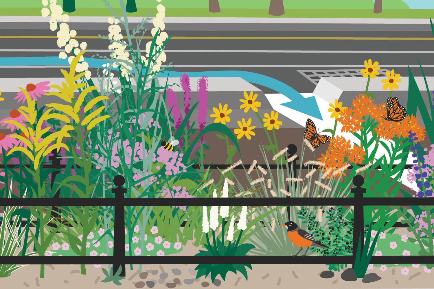
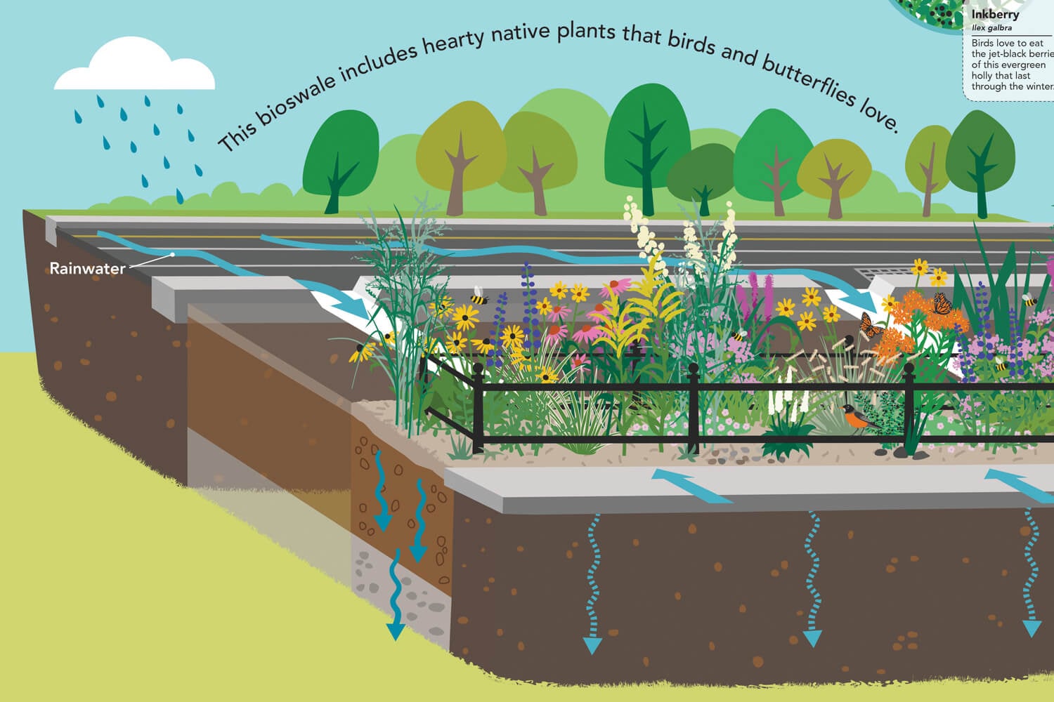
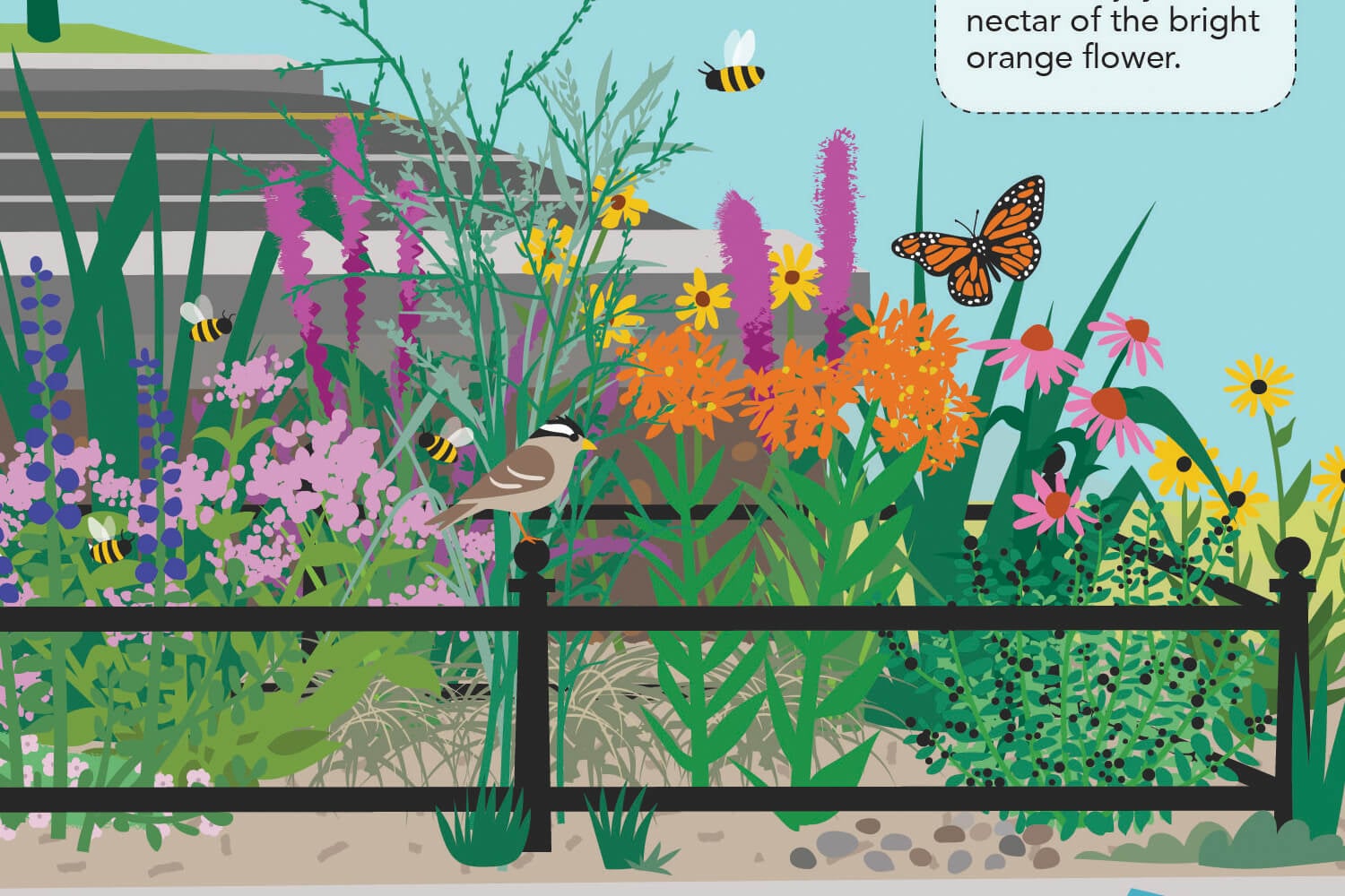
As part of my brief, I was supplied with a sketched out plan view of the planting scheme of the bioswale. I illustrated all the different plant species and arranged them so they are approximately in the correct position (the sign will be right next to the bioswale so it needed to be fairly accurate!). The main problem though, was how to show where the rainwater flowed into the bioswale, as the inlets are effectively obscured from view when standing on the pavement. I opted to do this by basically slicing the back off the isometric cross section, and sliding it back so that the inlets could be seen.
The purpose of a bioswale is to provide somewhere for rainwater to flow into rather than into the sewer system which can become overwhelmed - sending overflow polluted water into the local waterways, in this case the West River and Long Island Sound. The plants are specially selected to encourage wildlife, and importantly help clean the water as it filters through the roots, soil and stones below the surface.
CLIENT PERSPECTIVE
I was interested to know why Tracy approached me to work with her on this project...
Had you looked at other creatives who may have been able to deliver this work? If so, why did you decide to work with Carys?
I looked at at least 5 or six. The others were good, but I liked the creative playfulness of Carys's work and the very good color sense made my decision to use her. Also her understanding of the content. The sign I was designing was a template for future signs for the organization I was working with and I thought her style would be an inviting friendly approach for interpretive signs for this environmental non-profit. The other illustrations I looked at did not have character... Too blah, impersonal. I saw cheerfulness in Carys's work.
Did the fact that we work in different countries present any problems for you? Was there anything particular that made distance an issue, or not really?
It was not for me and it worked with my client. Carys worked with the client directly for billing. I use illustrators from all over the world. Not an issue.
I'm hoping to be sent some pictures of the bioswale when the sign is in place, but in the meantime here are a couple of pictures to give a sense of the location.
TESTIMONIAL
"If I had to describe Carys to a colleague I would say she was professional, a creative problem solver and patient. Hopefully we can work together again!"
Tracy Stora | Freelance Art Director
RELATED PROJECTS
Wildfowl & Wetlands Trust: Illustrations to help children learn about The Water Cycle
Cambridge University Press: Illustrations for a non-fiction book titled A Drop of Rain, aimed at Key Stage 2 (age 7-11)
SEE MORE
Illustration | Brand Identity | Art Projects


