

PROJECT: BRAND & WEBSITE DESIGN
CLIENT: PAPILLON CREATIVE
At the time I worked on this project Papillon Creative were a Greenwich based haberdashery and craft shop selling all you could possibly need to make all kinds of things! Since then, Barbara Cieleszky, my client and the owner of the business, has moved to America - She continues with Papillon Creative from there.
OBJECTIVE
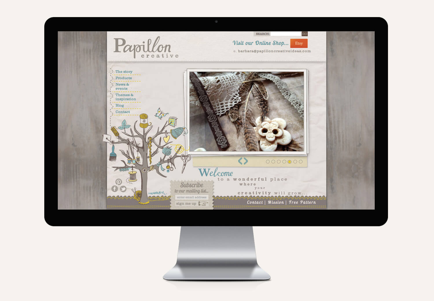
To develop a new logo, brand/illustration style and website design for the shop. The website was to have an online shop aspect by linking through to Etsy, but the intention was for it to primarily be a source of inspiration for craft-based projects.
From the initial logo options I developed, the selected logo has a handcrafted and 'found type' feel, being constructed from a number of different fonts. The concept behind this was to give a nod to the idea of crafting something from disparate elements, which is a big part of the ethos of Papillon Creative.
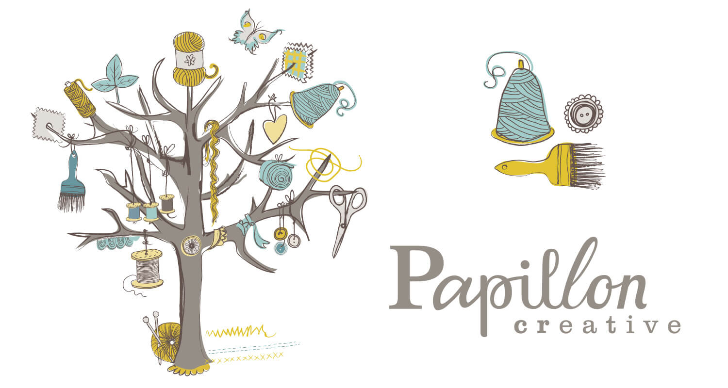
I was also briefed to come up with an illustration style to be used in conjunction with the logotype. The idea of a tree came from images I had seen of driftwood, that Barbara had used in some of her shop displays - it seemed like a neat way to pull together lots of smaller craft related items and to show the sort of items available in the shop. Elements from the tree could be used in isolation or as a whole, and provided a good kit of parts to utilise in the print and website designs.
Business card and Postcard
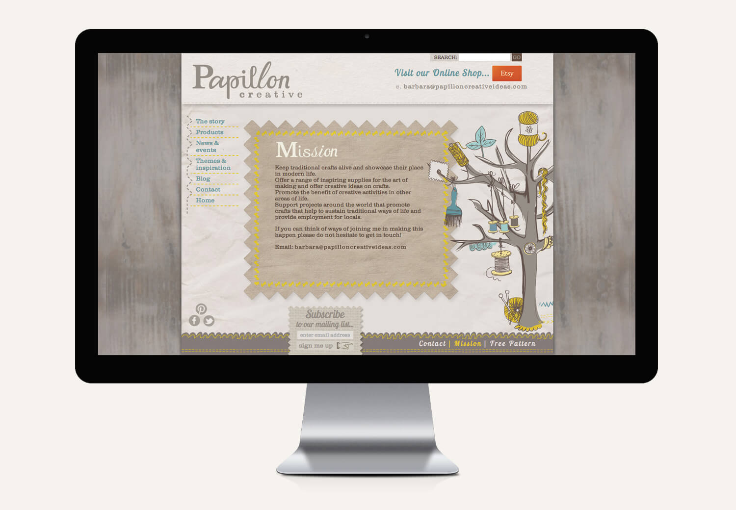
Below are some images from the website, or view the live site here
Website development by Kinetic Pulse
CLIENT TESTIMONIAL
"Carys is the rare combination of someone who is highly organised and at the same time is able to think out of the box. She's worked on my logo/website/blog and social media and built a professional as well as creative image for my brand on the web. She's also helped with making sure that it's all consistent and was willing to put her own ideas into the work as well as respected my direction."
Barbara Cieleszky | Papillon Creative
RELATED PROJECTS
Branding with a hand-drawn feel for Ravenspoint Marketing
Vintage typography and similarly muted tones for Caroline Nash, a ceramics designer/maker


