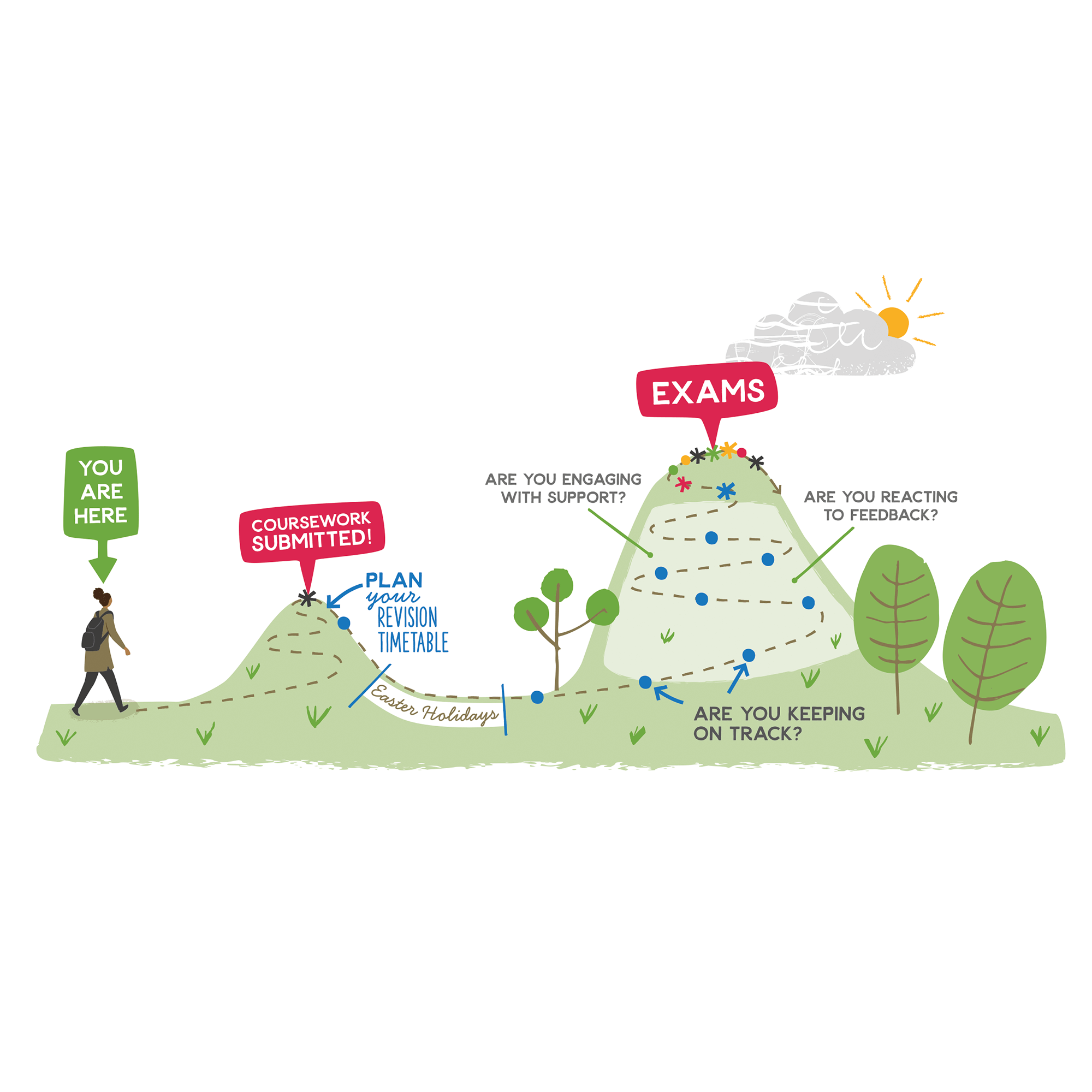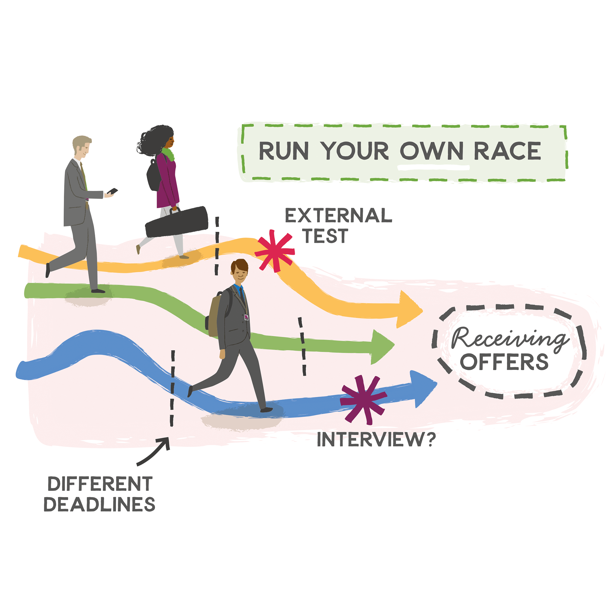


PROJECT: SIXTH FORM JOURNEY MAP ILLUSTRATIONS
CLIENT: BRISTOL CATHEDRAL CHOIR SCHOOL (BCCS) & MAMMALcreate
Design consultancy MAMMALcreate approached me to work with them on this project for their client Bristol Cathedral Choir School
OBJECTIVE
To produce a series of 10 spot illustrations to feature in 2 ‘text-heavy’ timeline/journey maps showing the various timings and stages within the 2 years of Sixth Form. The illustrations are intended to enliven quite ‘dry’ content and make it more engaging for students. The final layouts are to be printed at large scale for display on noticeboards in the school corridors.
ABOVE (Top of the page): Illustrations for Timeline 1: General information about the journey for students going through academic years 12 & 13
BELOW: Illustrations for Timeline 2: Giving guidance on what students need to do to prepare for what comes next, Post 18, for example UCAS deadlines and applying to University/further education/training courses.


Supplied Colour Palette
There was a specified colour palette for the project - the 2 school colours, along with red, yellow, green and blue. In creating the illustrations I restricted myself to using these colours, but with the added allowance for tints of each colour, and black/shades of grey.
The following images are the final layouts designed by Lesley Hill at MAMMALcreate, incorporating the illustrations.
And to show some process… pictured below are my initial sketches for the project. I was supplied with documents which included the written content for each journey map. The budget didn’t allow for me to create illustrations for everything, so I selected the parts that stood out for me as key ‘checkpoints’, and that were also fairly well spaced out within the 2 year timeframe. The final layouts work around the illustrations, with the content being styled to complement…
CLIENT FEEDBACK
“It was an absolute pleasure to work with Carys on this project. The ‘journey’ illustrated by each board sounded fairly dry and complicated on the page. We wanted to make it more engaging to students – encouraging, enticing and clear to understand without patronising. Carys quickly identified visual highlights to bring each journey to life, injecting her illustrations with energy and bringing out the fun. She was very attentive to the details, taking on board the school ethos whilst representing the students’ individuality and engagement. She is a very clear communicator and the development of the illustrations was very smooth – the stages from simple written description to pencil sketch to final illustration allowed the school to approve the illustrations at the earliest stage, giving them plenty of input whilst keeping amends minimal. I really enjoyed working with Carys and look forward to working with her again.”
- Lesley Hill, Director at MAMMALcreate
RELATED PROJECTS
MATERNAL MENTAL HEALTH ALLIANCE | The 5 Principles of Perinatal Peer Support - Spot illustrations & poster design


