PROJECT: 'THE AGEING REVOLUTION' - ANNUAL REVIEW COVER ILLUSTRATION
CLIENT: ST MONICA TRUST / GREEN HAT DESIGN
St Monica Trust is a not-for-profit organisation delivering well-being for older people through innovative care, support and retirement accommodation in Bristol & North Somerset. They are 'Leading the ageing revolution'...
Green Hat are an ethical graphic design company based in Bristol. They have worked with St Monica Trust for many years, and asked me to create this illustration, which follows on from our previous collaboration on the St Monica Trust: Vision and Values.
OBJECTIVE
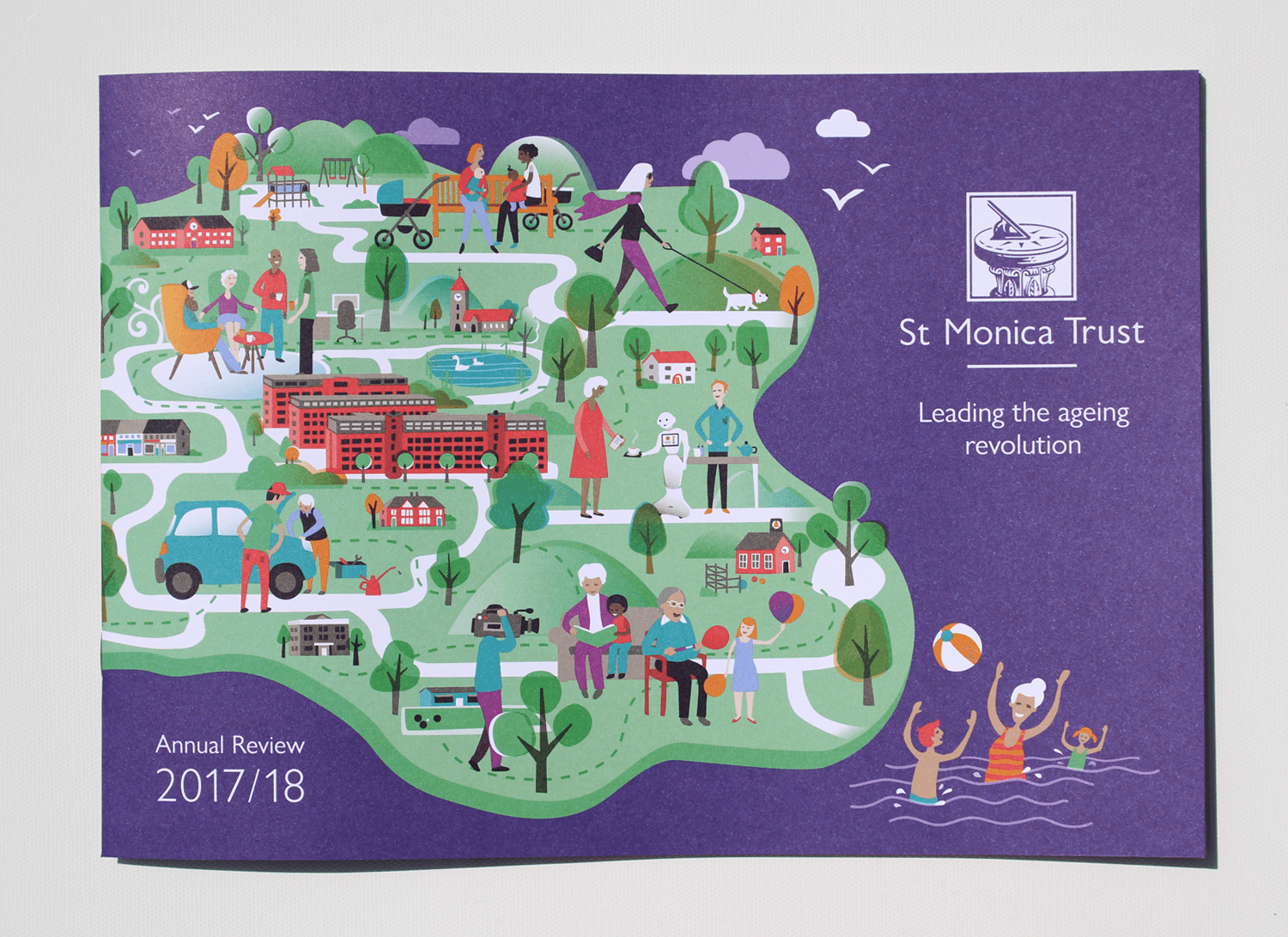
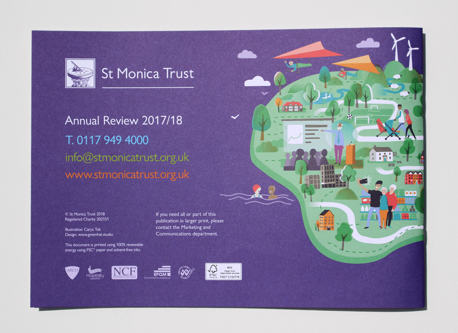
To create an illustration which depicts an idealised view of how the world would look as a result of the 'ageing revolution'. It is a vision of the future - A green and pleasant landscape where older people are integral to society and have the opportunity to share their knowledge, expertise and time, resulting in important outcomes for the wider community, as well as giving a sense of value and well-being to those involved.
I was briefed to include some key scenarios involving older people, for example: interacting with a friendly robot as a nod to collaboration with tech companies, lecturing university students and being engaged in activities with children (as from Channel 4's Old People's Home for 4 Year Olds, which features St Monica Trust residents). The red brick buildings central to the illustration represent The Chocolate Quarter which is a new St Monica Trust development, offering luxury retirement living alongside commercial business units and a range of amenities open to the wider community.
The illustration uses an existing St Monica Trust colour palette, developed by Green Hat Design.
The printed report...
And the digital artwork...
Front cover
Back cover
Pictured below, is my initial sketch for the illustration. This was presented to the client for approval, before proceeding to final artwork - To help with context and provide a better idea of how the illustration would sit, I positioned it in the supplied cover layout form Green Hat Design.
CLIENT PERSPECTIVE
For this project I didn't work directly with the client, the illustration was directed and commissioned by Andy Degg at Green Hat. However, once the project was complete, I was interested to find out a bit more about how the illustration had been received by the people it was created for - St Monica Trust. Ben Jailler had led the project for the Trust, and kindly shared his thoughts with me...
The illustration was intended depict a vision of how the world would look as a result of 'the ageing revolution’ - do you think it captures all you had hoped?
Carys’s execution of the brief exceeded our expectations. She ensured that all the elements essential to illustrating the world following ‘the ageing revolution’ were included and any changes suggested by us were implemented straight away.
I’d be interested to find out what sort of feedback you have received from others within St Monica Trust - does it sit well with the organisation and what you are all working towards?
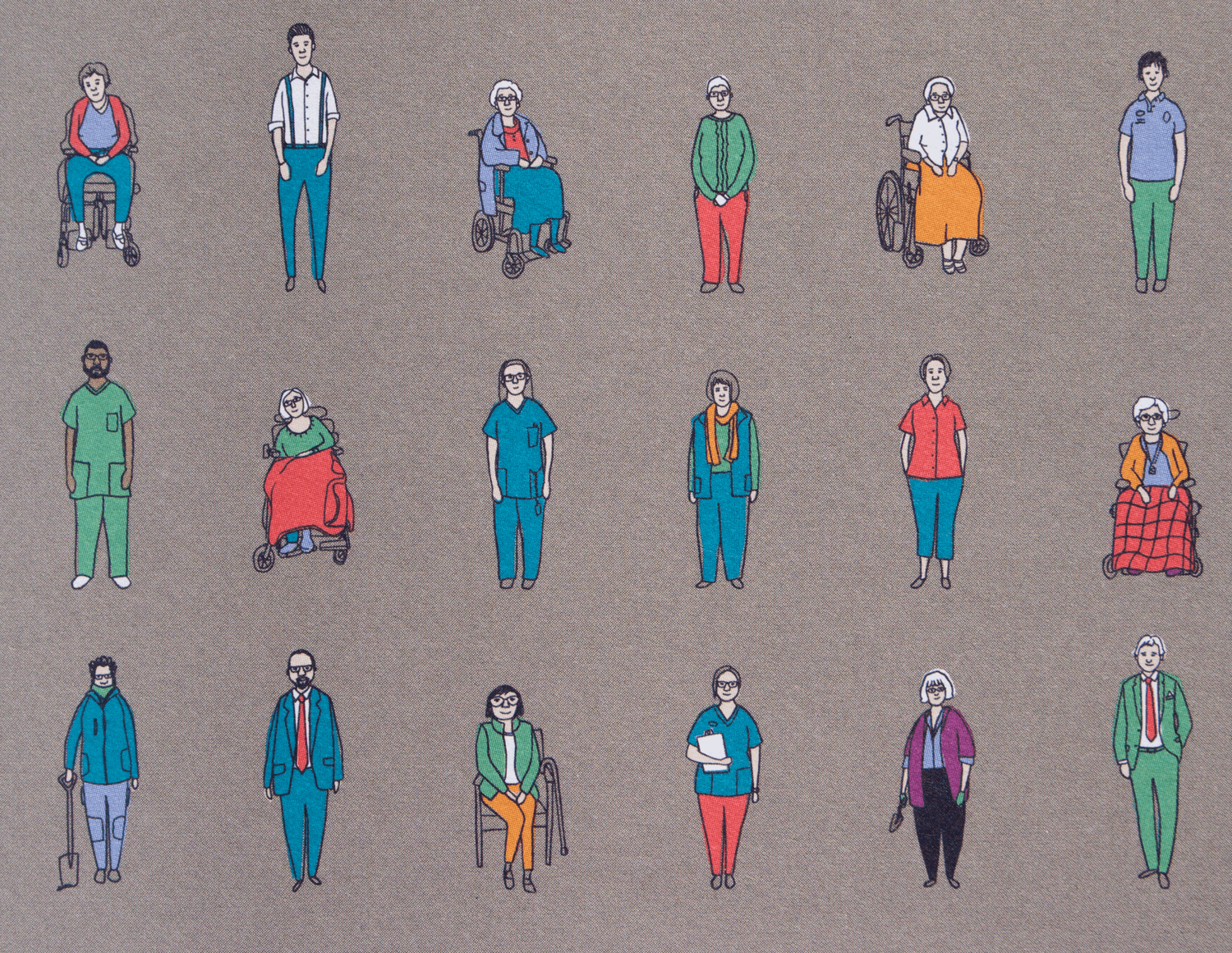
Carys’ style of illustrations fit extremely well within the organisation’s overall brand. Having created caricatures of colleagues for our ‘values’ campaign, we knew that Carys was the person to ask to produce an illustration that sums up the Trust positioning itself as leading an ageing revolution.
Finally, in terms of process, I worked with Andy at Green Hat to create the illustration, and time was fairly tight - Do you feel you had suitable opportunity to make comments/have input or would you have potentially asked for more changes if there had been more time?
We appreciated that we gave Carys an extremely tight deadline to complete the illustration for the front cover of our 2017/18 Annual Review. It was a tribute to her talent as an illustrator that her first proof was exactly what was required by us and only needed minor tweaks before being signed-off. A thoroughly enjoyable collaborative experience for all involved and Carys’ illustration is currently the talk of the Trust.
- Ben Jailler, Media Officer, St Monica Trust
RELATED PROJECTS
ST MONICA TRUST | Vision & Values materials (previous project for the same client)


