PROJECT: THE WATER CYCLE
CLIENT: WESSEX WATER
Wessex Water are a regional water and sewerage business serving 2.9 million customers across the South West of England.
As well as providing an essential public service, they have a long-term commitment to building a sustainable future - working with the support of customers, communities, employees and stakeholders to help tackle the climate emergency, support the communities they serve and contribute to the growth of the UK economy.
OBJECTIVE
I’ve been working with Wessex Water to develop a new illustration style for use across their brand materials, both online and offline.
The newly developed style uses colours and fonts from the existing Wessex Water brand guidelines
Following an initial development stage, this is my first completed project - an education resource piece for schools explaining The Water Cycle.
Some close-ups of the the finished piece…
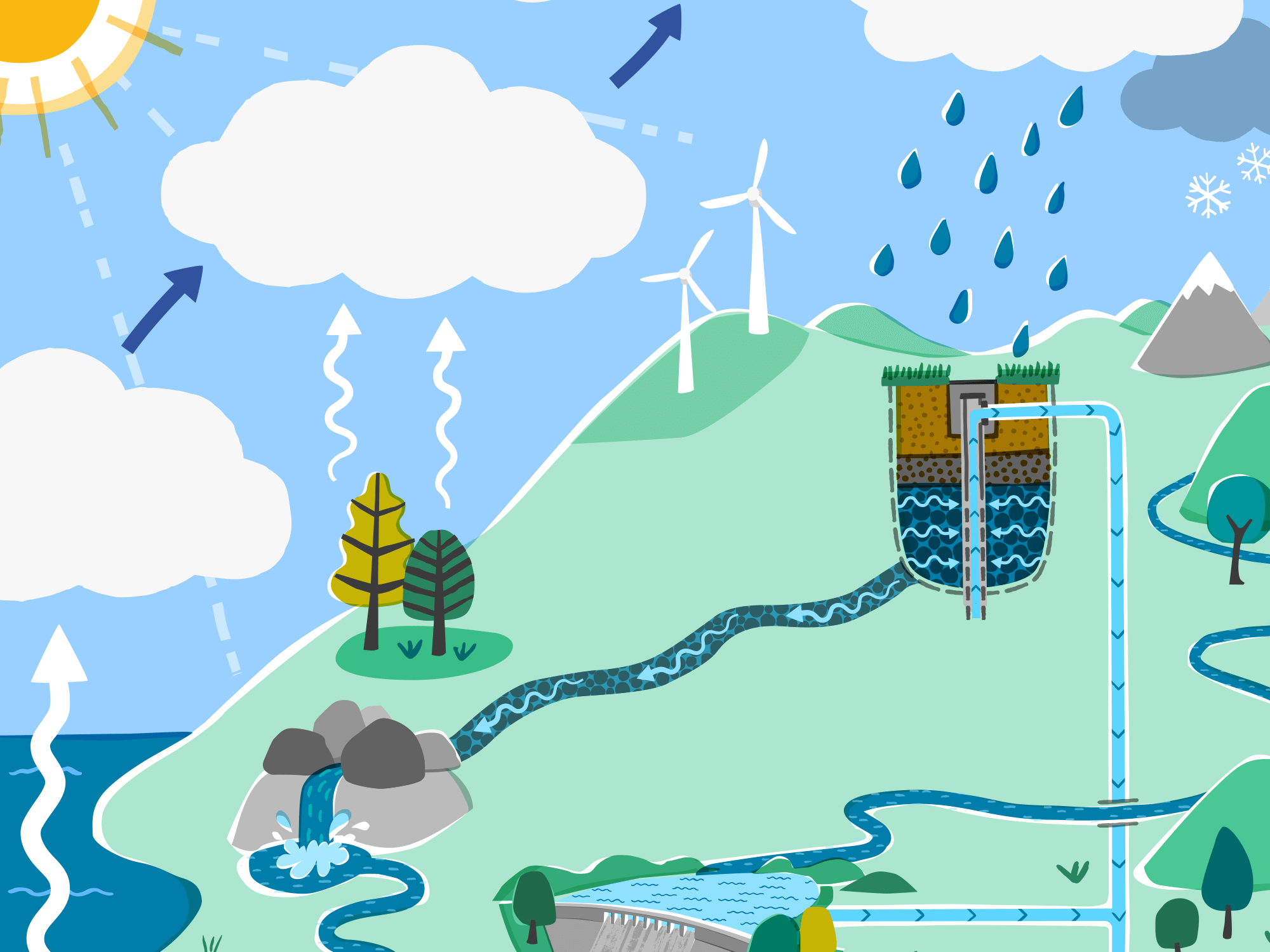
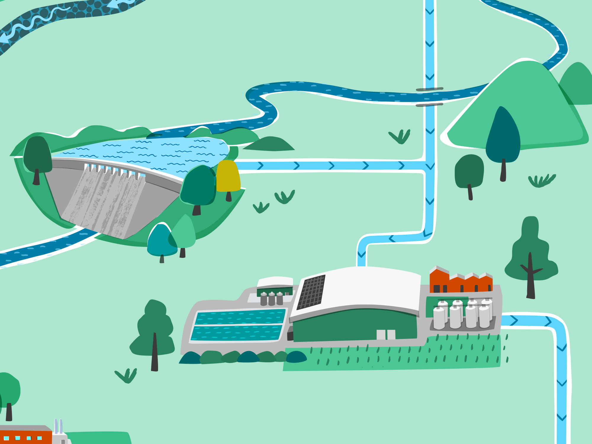

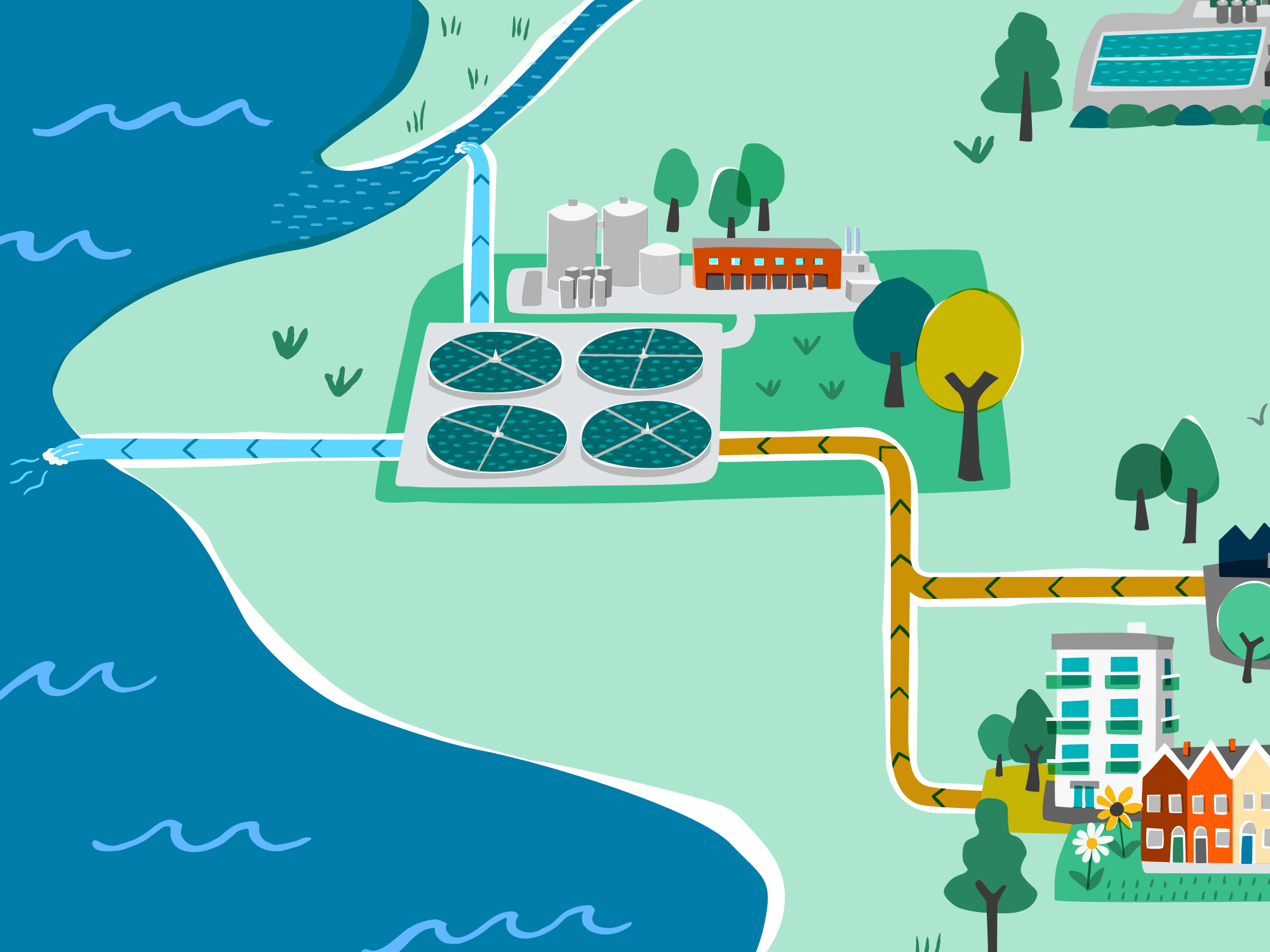
The style is clean and vector-based, with a simplified, organic and hand-crafted feel. I have introduced some hand-drawn patterns and details to bring a more friendly and approachable feel. And the occasional overlaying/mis-alignment of some colour and shapes is inspired by a screenprint aesthetic.
PROCESS
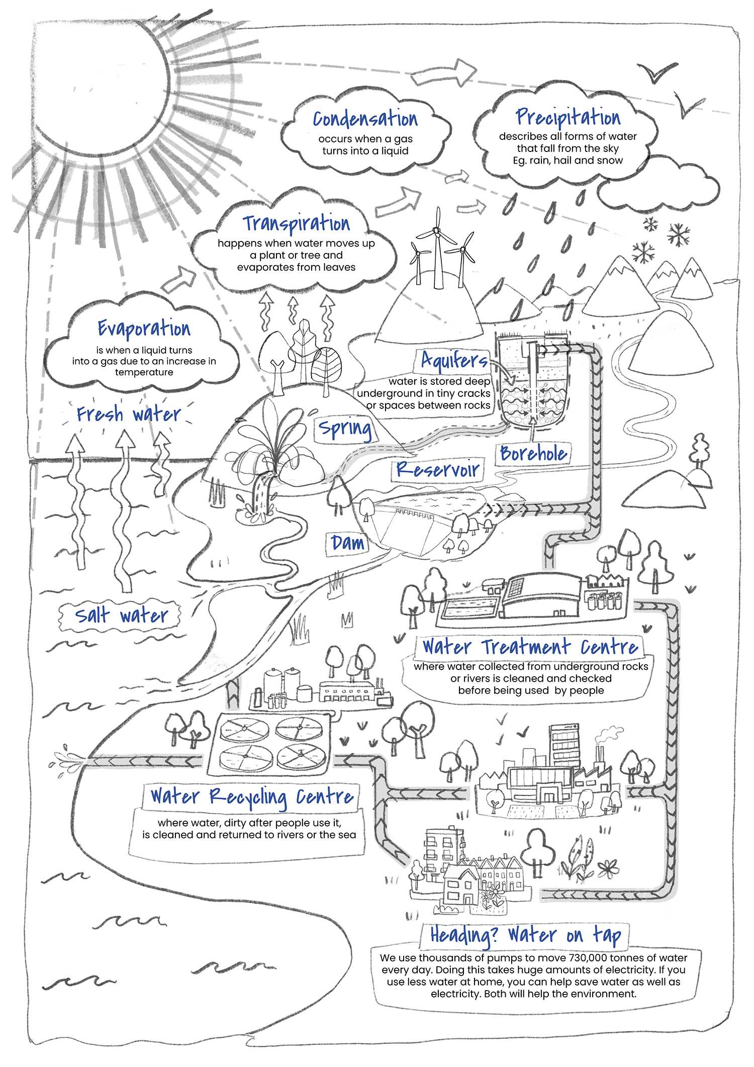
My initial sketch is shown below. Not much changed between this and the final piece, except from simplifying a few things - for example, a few less arrows and fewer lines on the sun rays.


