Read time: 5 mins easy reading… Grab yourself a cuppa!
Illustrated maps can be a brilliant, beautiful and fun way to capture the essence of a place, and really bring it to life for your audience.
Whether you’re mapping a geographical area, highlighting walking routes, or charting a journey or process, it’s important to be clear on why you’re creating the map and how it will be useful.
In this article I’ll guide you through numerous key factors it’s definitely worth considering, to help ensure the map you commission, and have created, is both engaging and effective.
1. What’s Your Vision?
Consider how an illustrated map could be beneficial for your business or organisation. What do you hope to achieve?
Some possible goals could be to:
Promote your business, event, or cause
Engage and captivate your audience
Enhance understanding and appreciation of a location
2. What’s the Purpose of the Map?
Think about the primary purpose of your map.
Do you want it to:
Capture the geography and character of a place?
Assist with navigation and wayfinding?
Highlight significant landmarks, features, and facilities?
Connect places with a common theme? Eg wildlife to spot or the tastiest food stops…
Celebrate a particular area or moment in time?
Depict a process or journey towards a specific end goal?
Create a personal keepsake or art piece
3. Simplicity vs. Visual Interest
Decide on the level of detail that feels right for your map.
Consider the following options:
‘Super Simple’ - A basic plan approach, with minimal illustrative details
‘Clear AND Interesting’ - A visually appealing map with many illustrative details, but that still provides clarity
‘Fully Loaded’ - Packing it with intricate details and hidden gems for exploration
I’d say this ‘Celebrating Filton’ art piece is a good example of a ‘fully loaded’ map, with lots of details to discover
4. What to Include:
Make a list of specific elements you’d like to feature on your map.
This could include:
Key landmarks, buildings, and noteworthy natural or man-made features
Specific roads or paths, and whether these should be labelled?
Unique aspects like local wildlife or other points of interest
5. People and Stories
Think about whether you want to include people in your map to enhance its narrative and showcase the area's character. If you decide to do so, ensure diversity, accessibility, and representation of different ages and ethnicities relevant to the location.
6. Map Style
Are there any existing brand guidelines that should be taken into account?
Consider the general look and feel you’d like. Don’t worry too much about this if you’re planning to commission an illustrator to create the map for you - they will likely offer up some suitable style options for you
Decide whether functionality or aesthetics should take priority in the map design…or likely a balance between the two?
Also, see No. 10 Seek Inspiration…
7. Accuracy vs. Information
Decide how much importance to place on geographical accuracy versus highlighting essential information or key areas. Do you want your map to adhere strictly to scale, or are you open to some artistic interpretation to emphasise the most significant details?
In the example below, Exhibition Road was made much wider than it is in reality, to allow it more prominence as the main focus of the map and to make more space for the illustrated elements. The building features are positioned approximately in the right place, but do occupy more space than is actually the case. The design was created to give a general overview
South Ken Green Trail Map, created by me for Discover South Kensington
8.Size and Format
Take into account the size and shape of the area you're mapping and compare it with the desired format of the final map artwork - do they match?
If not, the map will either need to be adjusted to fit the desired format, (perhaps cropped or drawn from an angle) or there may be space for additional close-ups or extra content.
9. User-Friendly Design
Consider the needs of your map's users.
If the intention is to help with navigation, strive to create a map that is clear, easy to understand, and provides relevant information.
If you plan to have the map printed - choose a manageable size
To be available for download and printing at home - ensure it’s home-printer friendly - fits an A4 page size and doesn’t rely on printing to the edge of the paper
10. Seek Inspiration
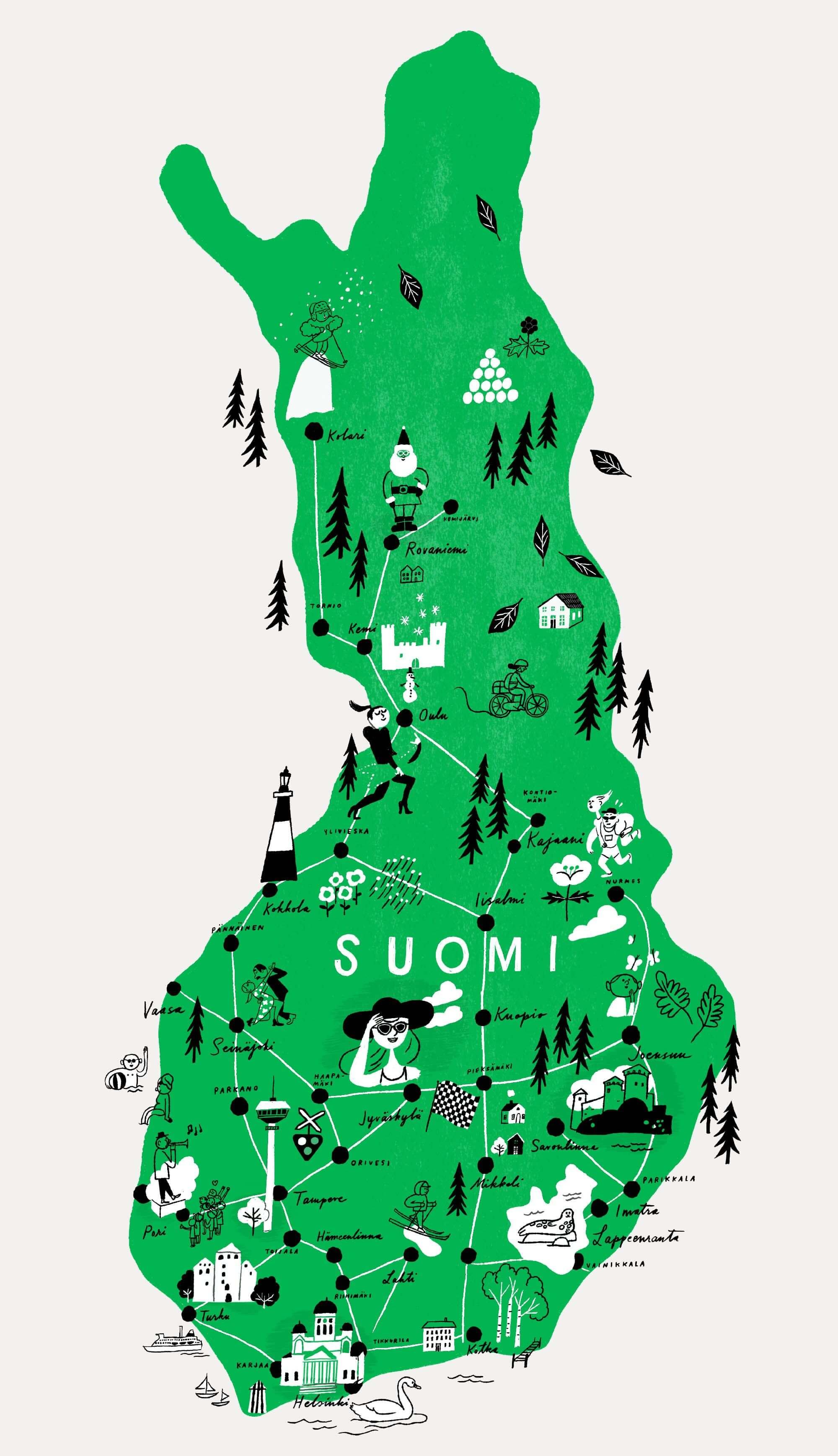
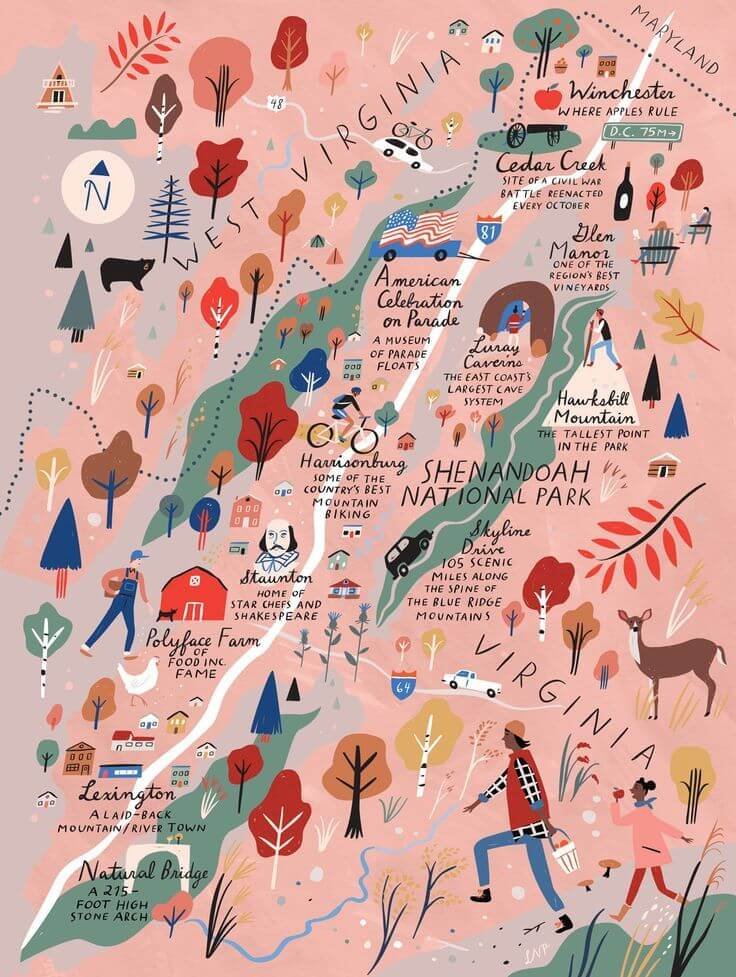
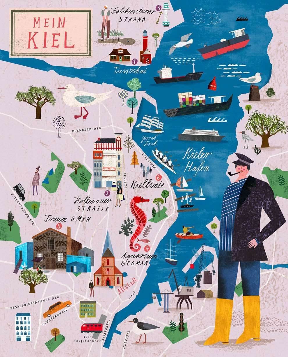
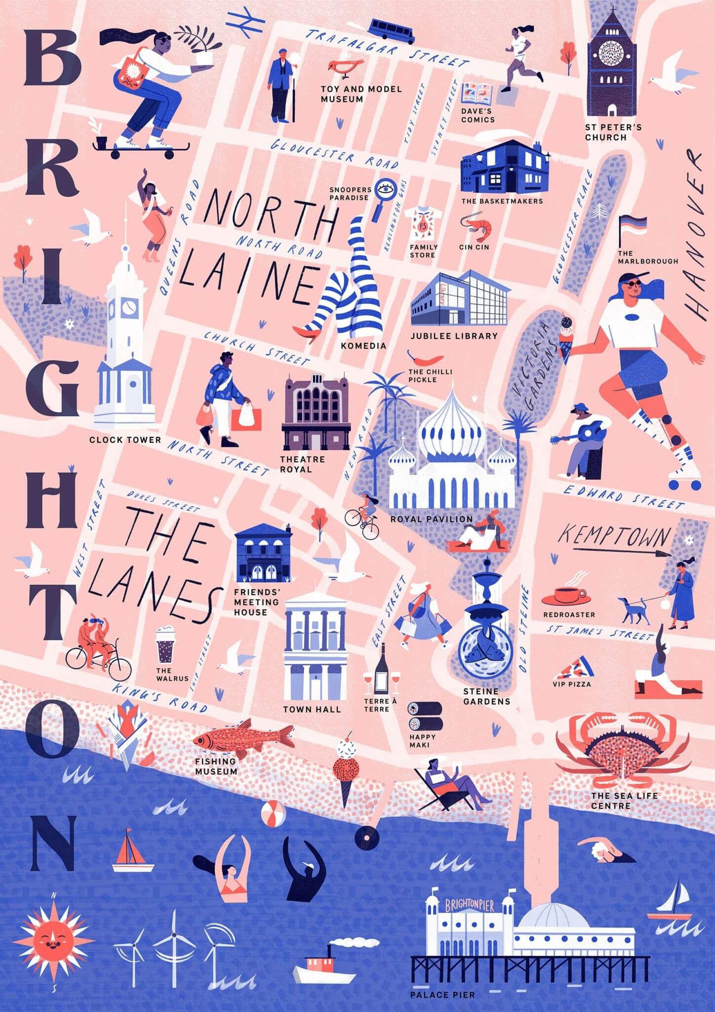
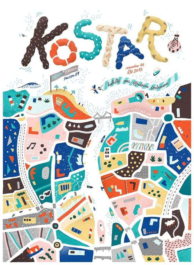
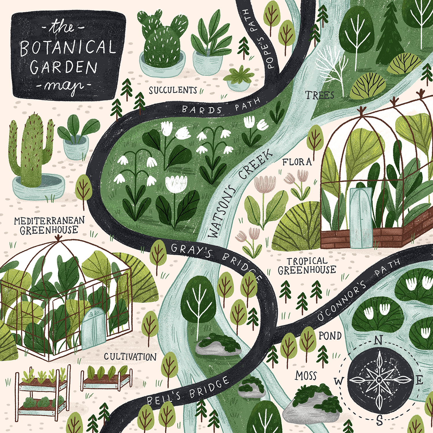
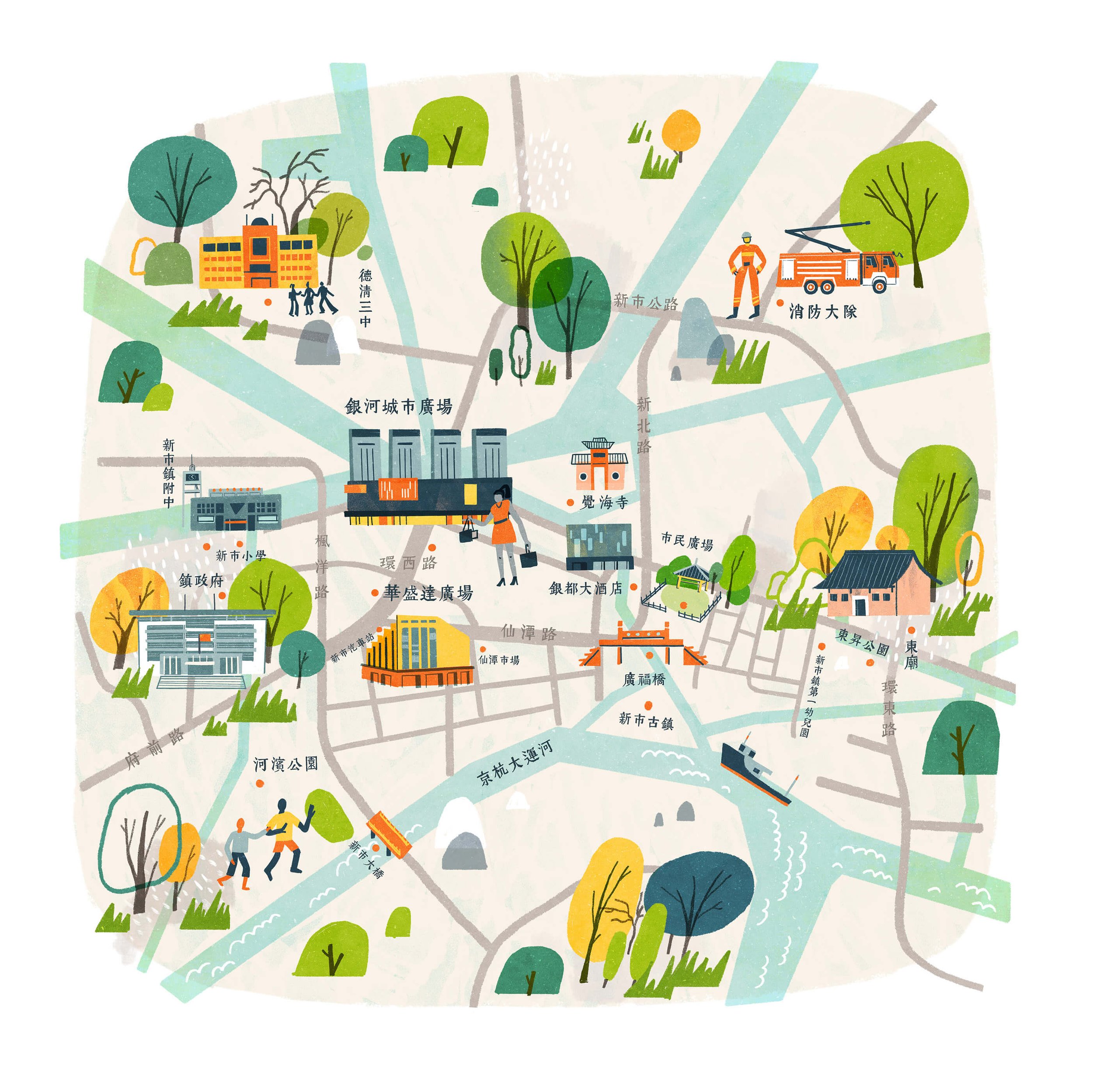
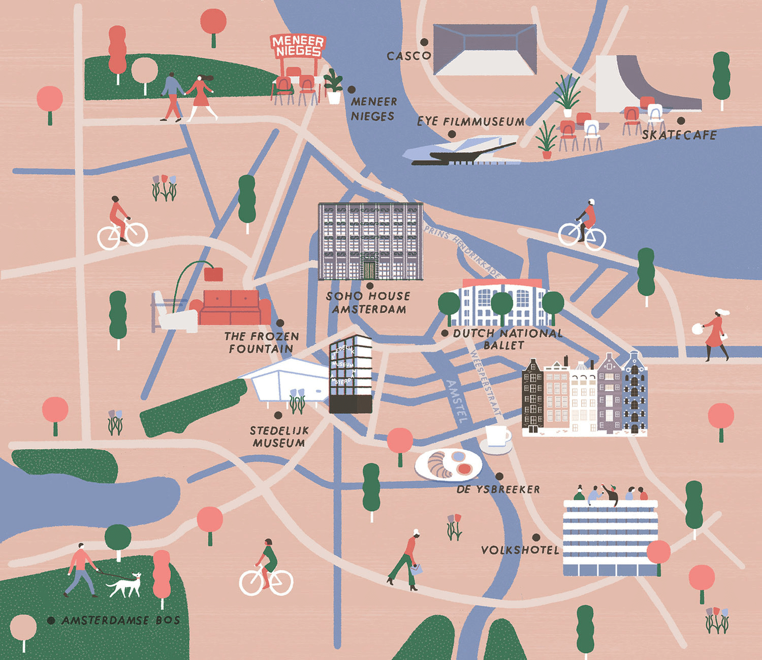
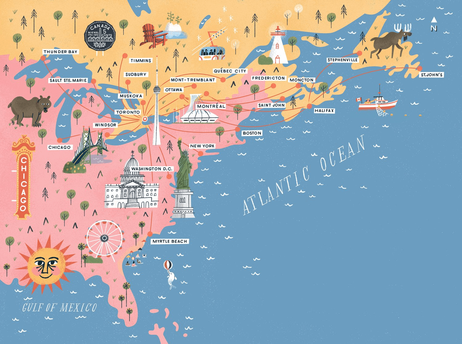
Take a look at some other illustrated maps, and get a feel for the sort of style you think could work for your project. The intention should be to create something bespoke and unique to you, but it’s interesting to notice the different styles, layouts, and approaches used in other similar maps.
As a start, here are a selection of maps that caught my eye from a quick look on Pinterest.
Created by a range of different artists and illustrators, I’ve included the artist names, and if you’re quick and click on the images it should take you through to their individual websites.
Conclusion
Commissioning a bespoke illustrated map, specifically for you or your organisation can be very exciting!
It offers the opportunity to have something crafted which is highly personal and unique to you or your brand, but more importantly, an illustrated map is a powerful tool to convey information in a visually engaging way, benefitting your audience, visitors or customers.
By carefully considering the intended purpose of the map, the details, featured elements and user needs, you will be well-equipped to brief and collaborate with an illustrator or map-maker to bring your vision to life.
The next step is to shortlist some potential illustrators who feel like a good fit for your project and reach out to them... Go search some out!
I wish you all the best on your map-making adventure - Good luck!
This article draws reference from my experience of crafting illustrated maps for a range of different clients and collaborating with them to ensure that the final map is informative, visually appealing and well-suited for the intended audience.
You can see more of my illustrated maps here
And feel free to drop me a line if you have a potential map project you’d like to discuss


