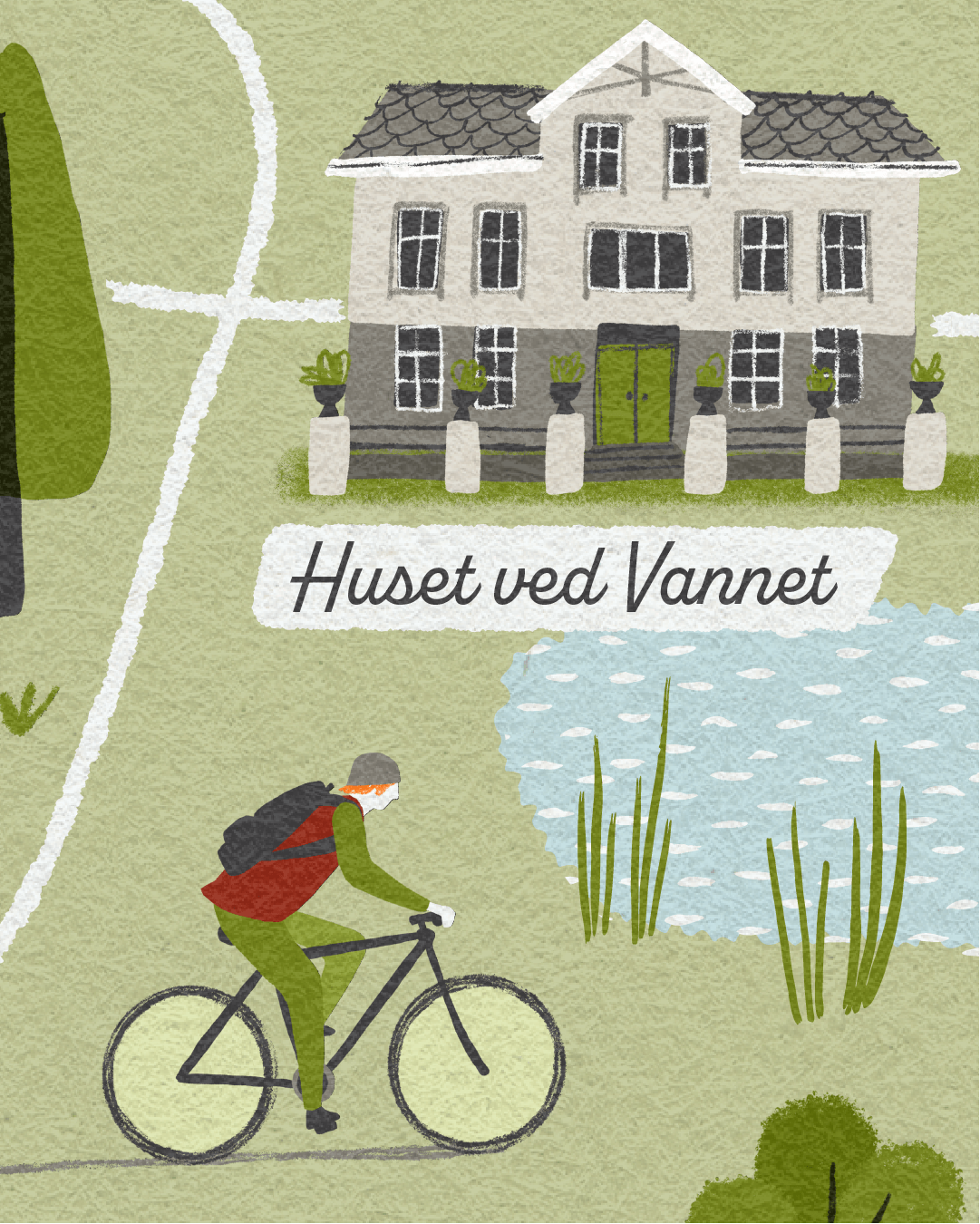
Read time: Around 12 mins - It you’ve read my posts before you’ll know I struggle to keep them short… There are lots of useful points though!
What’s this about?
It started out as an experiment/exercise for my own benefit - Taking a practical look at the various ways I could potentially go about creating an illustrated map, with the aim of finding out which is best.
I realise that for clients commissioning illustration, often it doesn’t really matter how work is created (you may not even care!)... as long as it looks good, conveys the appropriate information/message, and the artwork is fit for purpose.
However, I think it’s crucial to be aware, or at least have a sense of how illustrations are created (illustrated maps or otherwise) in order to be clear on any limitations there may be, should you wish to re-use the artwork at any point in the future, perhaps for something initially unplanned?
SPOILER ALERT - Limitations are basically dictated by the size and resolution the artwork is created - Read on to find out more…
In this post I’m going to explain and compare some of the possible methods - the digital processes - I use in putting an illustrated map together, and set out the Pros and Cons of each - Some points will be more relevant for the illustrators amongst us, whilst others are equally useful for clients and commissioners.
Test Conditions
I’m using an illustrated map as an example, but the various aspects would equally relate for any illustration work.
I have focussed on a illustrated map for exploring the different processes because:
I enjoy working on illustrated map projects
By nature, illustrated maps tend to comprise of many elements, so if the process of creating each of these elements is particularly time-consuming or laborious the impact can be hugely magnified
Where to start?
These are some considerations, when deciding on a suitable process for creating an illustrated map and the elements within it:
Aesthetics - What is the particular look and feel to be achieved?
Usage - Where/how the final illustration is to be used and at what size?
Future-proofing - Is there any possibility that the artwork, or elements from it, could be re-used for something else in the future?
Technicalities - What size should the artwork be created?
Complexity - How detailed should the elements be? To create interest without becoming over-complicated
Approach - Is there a particular method that would be more or less time-consuming/difficult?
Editability - Is the artwork easily editable, if any changes or adjustments are needed?
Method
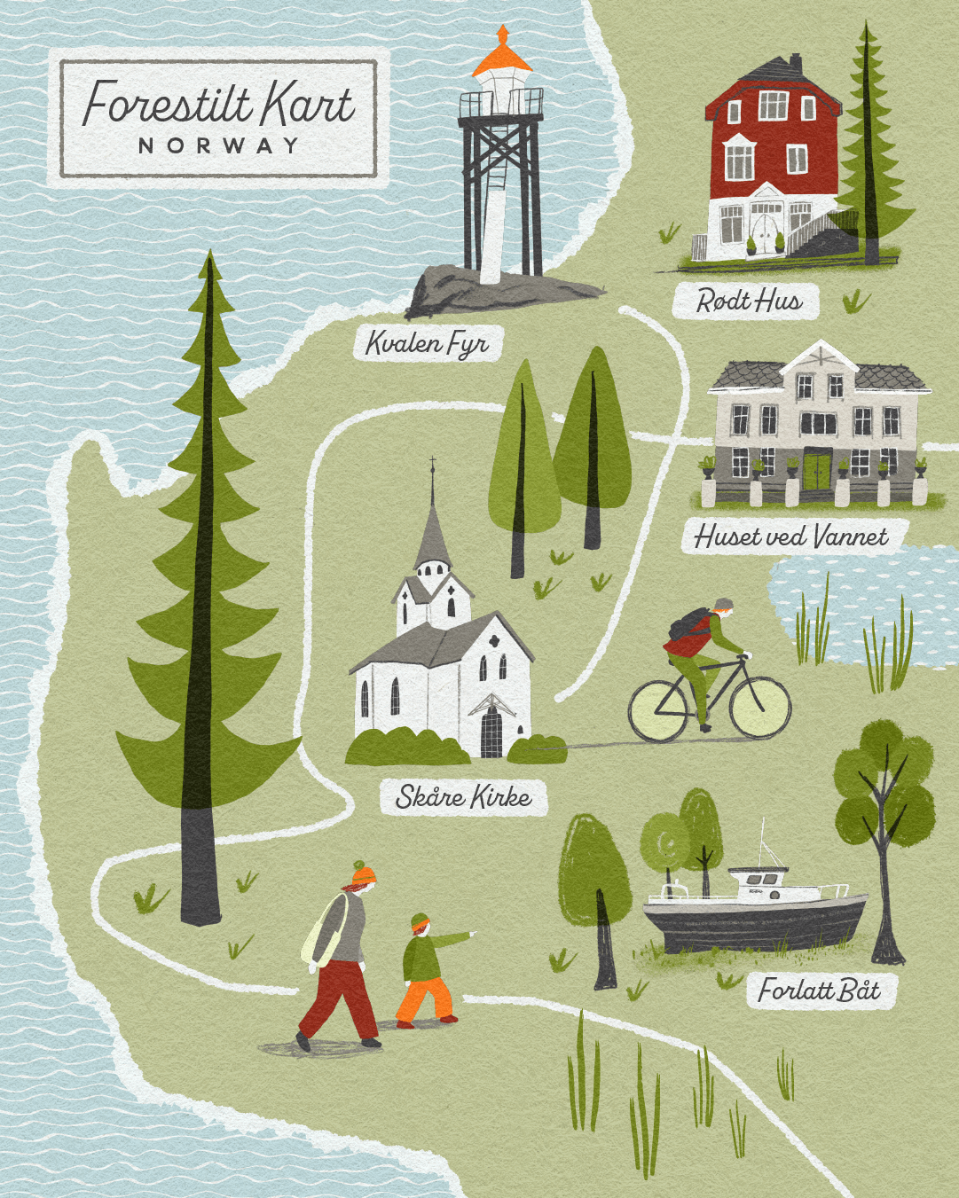
In order to conduct this ‘experiment’ I have illustrated 3 versions of the same imaginary map based on some photos I took on a trip to Norway last summer.
• I have created the same elements for the map using three of my preferred ways of working:
Adobe Illustrator on a Desktop Mac, creating all elements within Illustrator using a selection of custom brushes (some of which I’ve made myself)
Adobe Fresco - effectively hand drawing, but straight to vector, using Apple Pencil & iPad Pro
Procreate - pixel based software, again using Apple Pencil & iPad Pro
TO NOTE - Illustrators have many different tools available to them, and there are many different ways of creating similar (or completely different) looking artwork. All illustrators will have their own favoured styles and approaches. There are no right or wrong ways of doing things, these are simply the ways I tend to work as they suit my style and skillset. Other illustrators could for example, hand draw or paint on paper and scan it in at high-resolution, or work digitally in Photoshop - these are equally perfectly suitable and good ways of working, just not my natural go-to’s.
• The base map and typography for each version is the same, created in Adobe Illustrator - I always create these parts in Illustrator as for me it offers an accurate, fully editable and high-quality vector-based background for the map.
• In order to compare like with like, I have purposely tried to create each element with the same aesthetic style*, to show what is possible with each approach and what the limitations/benefits might be - You may not actually be able to tell the difference!?
• Having created the individual map elements using the different digital processes, I have then pulled these into Illustrator and added them to my ‘Master’ Map Layout
* Side Note: The style approach for this experiment is obviously not the ONLY style that can be created using each software/process, it is just shown as an example of what is possible.
The point of the exercise?
Over the years, I’ve worked hard to bring a hand-crafted feel to my work, however I choose to create it. Being that my favoured software is Adobe Illustrator - generally used for clean-lined vector-based artwork, it can sometimes feel like I’m making things difficult for myself!
I’d like to compare some of the process options available to make sure I’m working in the best way (for me), and also to ensure the work I create for my clients is of high quality and fulfills all possible requirements.
Through doing this I will be exploring:
Efficiency - What is the most efficient way for me to create an illustrated map?
Aesthetics - What can be achieved with each process, and which is best suited to my style and way of working
Pro’s and Con’s - in terms of creating the artwork
Functionality and any limitations - Especially relating to the artwork being pixel or vector-based
Results
Each version of the map is shown below, with elements created using the 3 different digital process. At first look they all basically look the same! I see this as a good thing, demonstrating that it’s possible to adapt the processes to fit my style and way of working. Also, the digital processes are really just tools, with the end result of any illustration/artwork being mastered by its creator (…there’s no AI here!)
I’ve listed my Pro’s and Cons for each digital process below each map, and there are some close-ups further down to highlight the visible differences. My conclusions at the end….
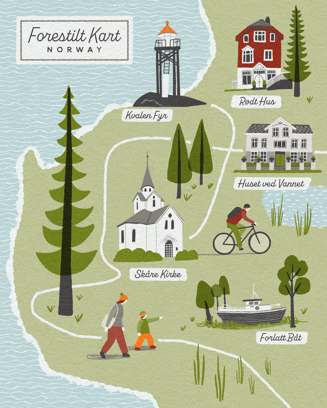
Map feature elements created in Adobe Illustrator
Adobe Illustrator is a powerful, industry standard software programme for creating vector-based graphics, logos and lettering. I really like the fact that everything is editable and that there’s never a problem with scale/resolution if the artwork needs to be used bigger than originally planned. To help give a hand-crafted feel I tend to use custom art brushes (some of which I’ve made myself), and sometimes incorporate more analogue techniques by introducing hand drawn elements and patterns which I photograph and convert into vectors.
Above: Sample Map - With feature elements all created in Adobe Illustrator
PROS
Vector-based artwork, everything is always crisp and sharp
Elements are fully editable, so colour changes or other tweaks aren’t a problem
Allows flexibility for possible future use - artwork can be scaled to any size without loss of resolution
Layouts and typography can all be done using the same software
CONS
Not always very intuitive when using brushes to add texture to lines or edges
Doesn’t easily allow for softness and subtleties
There’s a tendency to get over-complicated, when adding small details (…although that could just be me!)
Can be quite time-consuming as more details are added, and with potential for trying out all possible options
Map feature elements created in Adobe Fresco
Adobe Fresco is a drawing and painting app available for the iPad and other devices. I use it for it’s vector-based capabilities, although there is much more you can do with it. Generally, I don’t find it as intuitive to use as Procreate, so if creating pixel-based artwork it probably wouldn’t be my preferred app
Above: Sample Map - With feature elements all created in Adobe Fresco
PROS
More intuitive for drawing than Illustrator, as the Apple Pencil is used
Is a bit quicker creating individual elements
Vector-based artwork, everything is always crisp and sharp
Once you’ve settled on a brush for drawing that’s it, there’s not scope to see how it could look with different brushes, so minimising time spent reviewing options
Integrates well with an Illustrator-based process and transfer to a desktop Mac is easy
Once in illustrator, elements are fully editable, so colour changes or other tweaks aren’t a problem
Allows for flexibility in possible future use - artwork can be scaled to any size without loss of resolution
CONS
There’s an extra process stage, going between Fresco and Illustrator, often involving some tidying up of stray points etc
You have to be careful with drawing different elements on different layers or issues can arise with overlapping shapes
Limited selection of vector brushes, and once an object is drawn it’s not possible to apply other brush styles (this could also seen as a positive?)
Personally I wouldn’t create the whole map layout & typography within Adobe Fresco
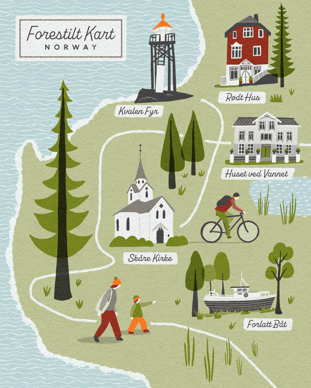
Map feature elements created in Procreate
Procreate is a brilliant drawing and painting app available for the iPad, and other devices. I use it for creating sketches on all my projects. Artwork is pixel-based rather than vectors though.
Above: Sample Map - With feature elements all created in Procreate
PROS
Intuitive for drawing and fun to use
Feels quicker than creating elements in Illustrator
A great range of art brushes are available, so images can include much more subtlety if that’s the desired effect.
Eg. pencil stroke lines and distressed texturesElements can be placed into Illustrator artwork as PNG images with a transparent background
CONS
Any tweaks or changes are a bit of a pain as you need to go back to Procreate rather than doing them within Illustrator
Doesn’t feel so accurate or editable as vector artwork
For more complex illustrations or to safeguard for possible changes sometimes you can run out of layers
Artwork is pixel-based, so elements need to be created ideally at a bigger size/higher resolution in order to allow for some flexibility in possible future use
More difficult to be consistent across multiple illustrations - changing colours across a set of separate elements, for instance
Personally I wouldn’t create the whole map layout & typography within Procreate
FURTHER EXPLANATION
Can you tell the difference?
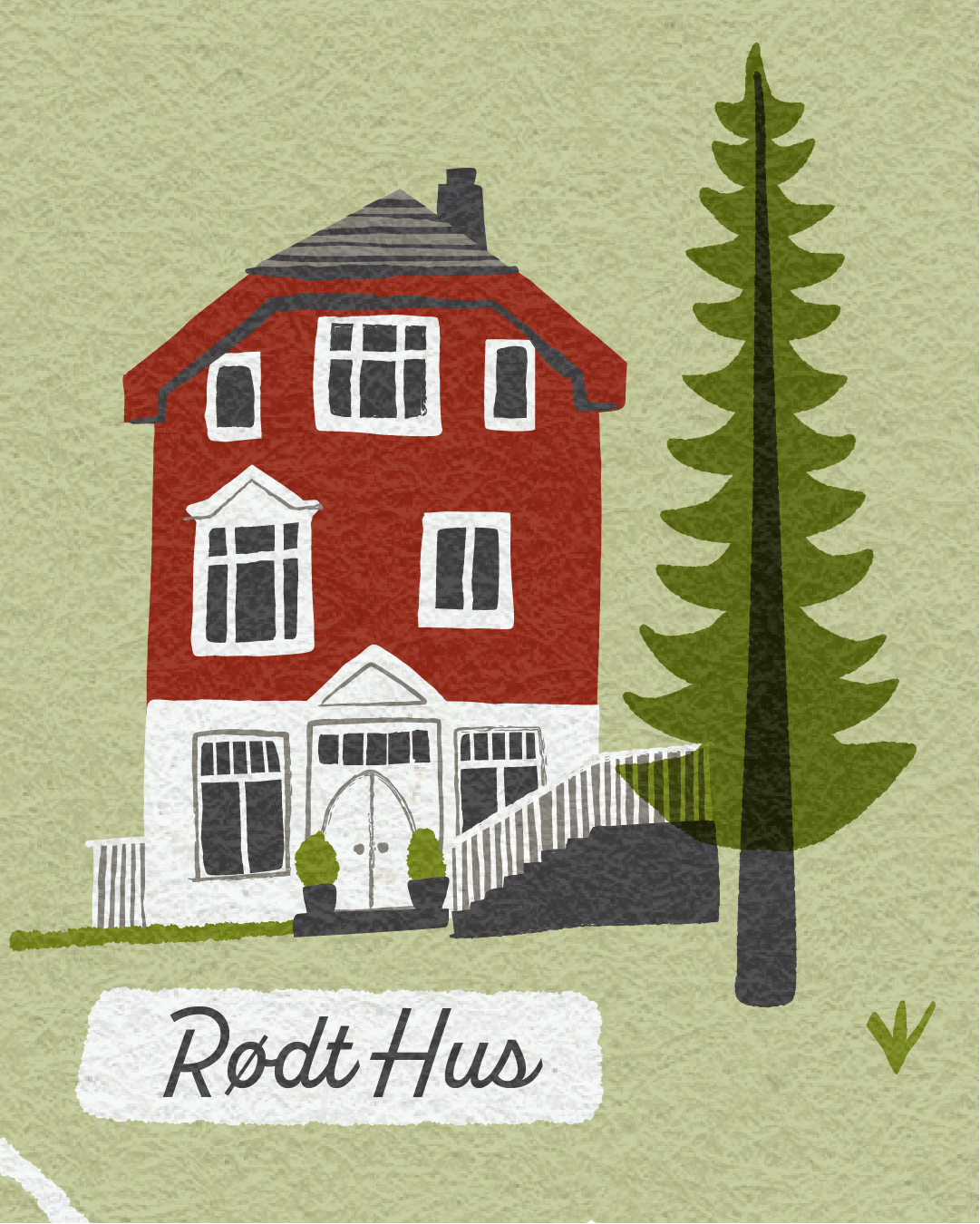
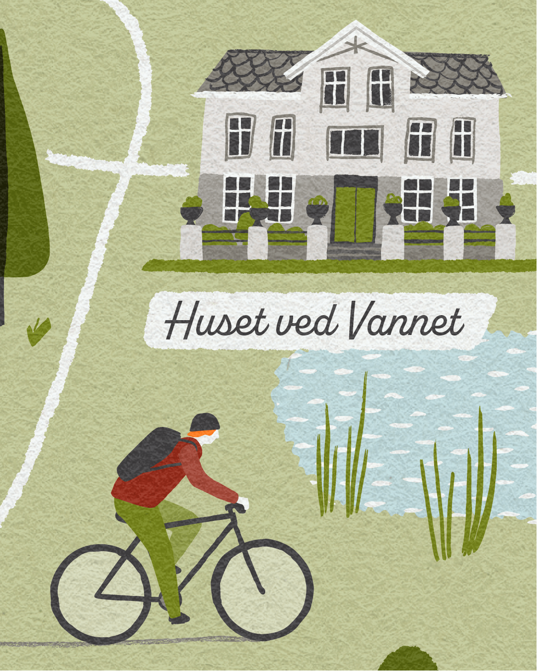
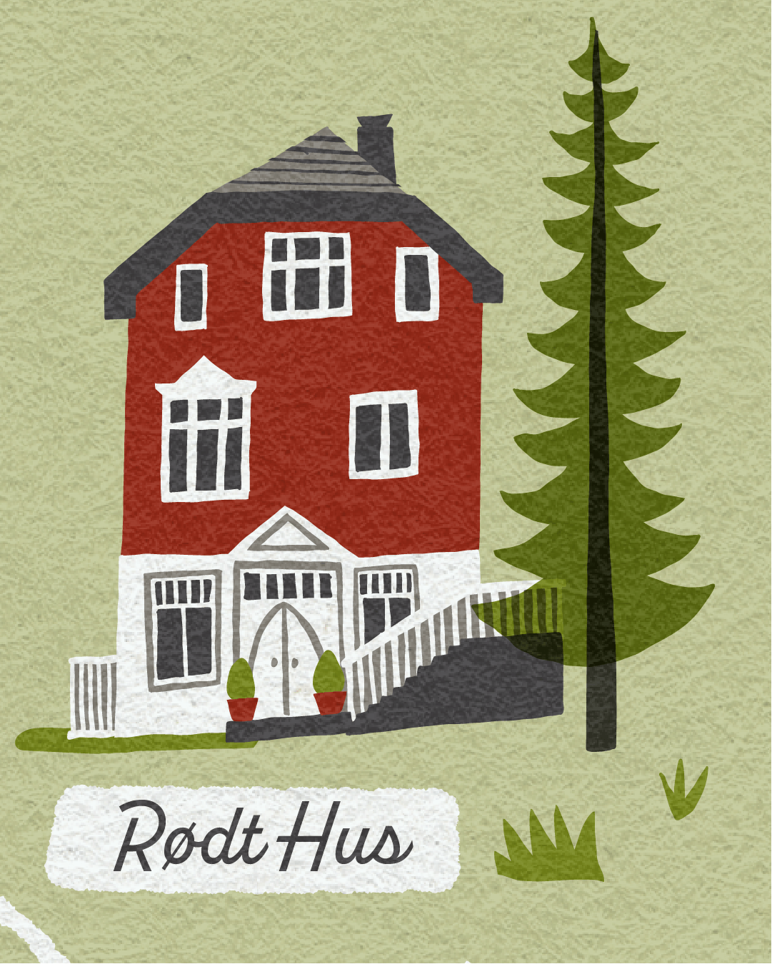
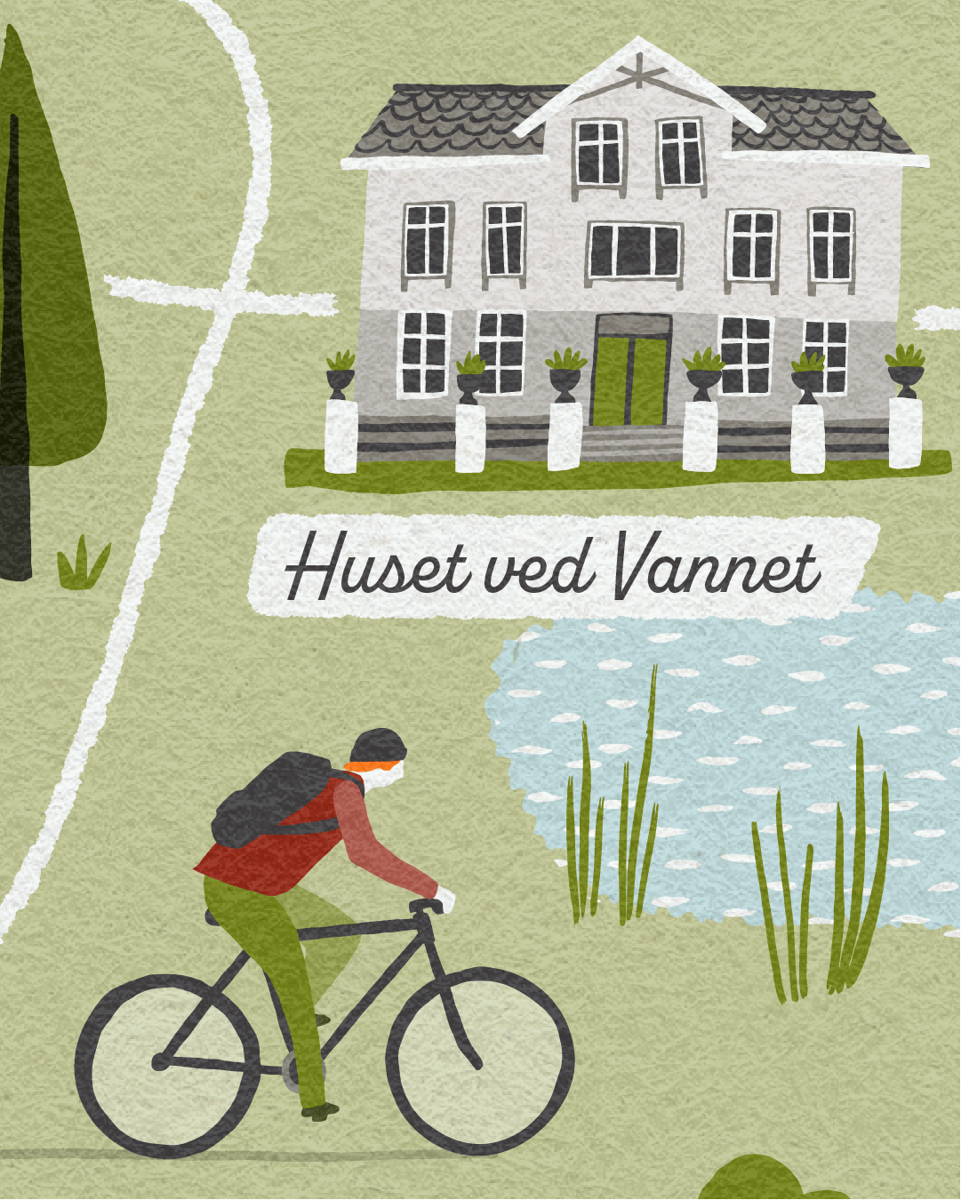
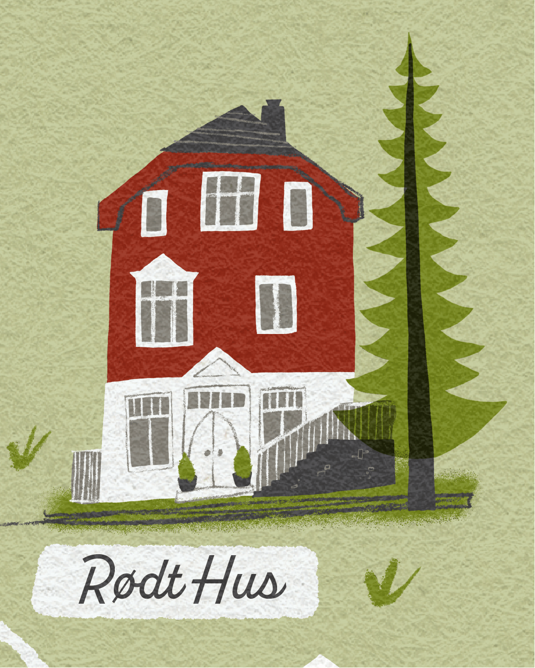
Here are some close-ups of a couple of the elements created in the different ways, for comparison. (Click the image to enlarge)
The differences are fairly subtle, I’ll try to describe them in simple-ish terms:
Adobe Illustrator - Art brushes can be applied to vector-based shapes and lines to achieve a particular look, in this case a slightly wiggly hand-drawn feel. The brushes can be selected as appropriate, and adjustments can be made to weight and colour, it’s all editable meaning virtually endless possibilities!
Adobe Fresco - The various elements within the illustrations are drawn by hand using the Apple Pencil, having selected a suitable vector brush (from a fairly limited selection). The drawing made takes on any attributes set for that brush. Eg brush shape and smoothness, and can then be adjusted by erasing parts or tidying up if necessary. It isn’t possible to change the brush style after something has been drawn. In this instance the hand-drawn feel comes from the natural wiggle of my drawing, rather than the brush, with edges being hard rather than with any texture or softness
Procreate - The drawing is done again with the Apple Pencil, but here a rough or softer feel can be achieved with the available brushes, many of which replicate regular drawing materials - such as pencils, charcoal, and all manor of paint styles! Areas can be eased or redrawn as required.
Not sure what I mean by Vector?
The above image shows the underlying basis of vector artwork - points, lines, shapes and curves, all editable and moveable with handles to adjust curvature etc. Brushes and colour fills/strokes are applied to create the appearance of the final illustration. The artwork is scaleable because of the vector framework that underpins it.
The pixels image - I’ve zoomed right in to show how the image can appear soft and blurry if it was to be used bigger than intended, and the size/resolution the artwork had been created at didn’t allow for this. Obviously this isn’t a problem at all if the artwork is created at a suitable size to allow for the required uses.
Texture
I love incorporating texture into my illustrations as I think it adds a more tactile and friendly feel and generally makes the work feel less ‘computery’. One relatively simple way I do this is by overlaying a paper texture over the top.
To Note: For all my talk about the benefits of vector artwork, this essentially is introducing an element that isn’t vector! Should the artwork ever need to be used at a bigger size, it’s a relatively easy fix though - the whole artwork would be adjusted to the required size and then a larger/extended version of the paper texture added back in over the top.
Conclusion - From an Illustrator’s Perspective
Efficiency
I roughly tracked the time I spent creating the individual elements in each process.
For these types of map elements it was a bit quicker using Fresco or Procreate over Illustrator. However, both of these potentially have an extra process stage - for Fresco a little tidy up/organisation in Illustrator, and for Procreate potentially a bit of back and fore for any tweaks/changes.
So on balance, time-wise there’s probably not that much in it.
Aesthetics
As can be seen, similar styles can be created with all 3 processes. I do like the subtleties that can be created with Procreate, perhaps not shown to full extent in this artwork, but I’m not sure if it’s worth sacrificing editability?
Overall
This is my personal opinion on what would be a suitable approach, and likely the best way for me to create future illustrated map projects. As mentioned above, other illustrators may work differently and favour other approaches, these may be no better or worse than what I’m suggesting…
I’d say Adobe Fresco and Illustrator are fairly interchangeable and I think it’s perfectly feasible to create some elements in Fresco and have these working alongside other details created directly in Illustrator - I have worked in this way and it basically allows for maximum flexibility/editability, is a bit more fun drawing some of the elements with the Apple Pencil than doing everything in Illustrator and means you get the best of both worlds.
I potentially would consider a Procreate option if the intended style needed more textural elements or a softer feel, and if it was unlikely that the artwork would be used a larger size than specified. Eg for an editorial illustration, where there was just a one off use.
Otherwise, I’ll be honest I personally get nervous when my artwork isn’t vector-based! I like to know I’m covered for all eventualities and whatever *might* be required in the future.
Conclusion - From a Client’s Perspective
As can be seen, the difference in process doesn’t necessarily make all that much of a difference to the aesthetic outcome of your illustrated map (or any other illustration).
However, the experience, style and sensibilities of all illustrators may vary, and not everyone would use each of these digital processes in exactly the same way. If looking to commission an illustrator, I would suggest finding an illustrator whose style you like, and letting them advise and take the lead on how they would best create any artwork.
I hope it has been useful to describe and explain the differences between the vector-based or pixel-based processes, so that if interested, you can understand how the artwork is created, and how it may affect potential use of any illustration work you commission.
I think the key is to be clear on how you intend to use the work and fully consider whether there is any potential for future use, as this may affect the size at which the artwork should be created.
I hope you have found this post useful. I you have any questions or comments, or indeed a future illustrated map project to discuss (!) please do feel free to email me

