PROJECT: PRESS CAMPAIGN ‘ENJOY A FULL & ACTIVE RETIREMENT
CLIENT: ST MONICA TRUST / GREEN HAT DESIGN
St Monica Trust is a not-for-profit organisation delivering well-being for older people through innovative care, support and retirement accommodation in Bristol & North Somerset. This campaign was initially created specifically the rural retirement village at Sandford Station, in the Mendip Hills. A follow up campaign created early in 2021 builds on the same approach but relates to the range of settings & locations offered.
Green Hat are an ethical graphic design company based in Bristol. They have worked with St Monica Trust for many years, collaborating with me on a number of recent projects.
Original campaign illustration, Sandford Station
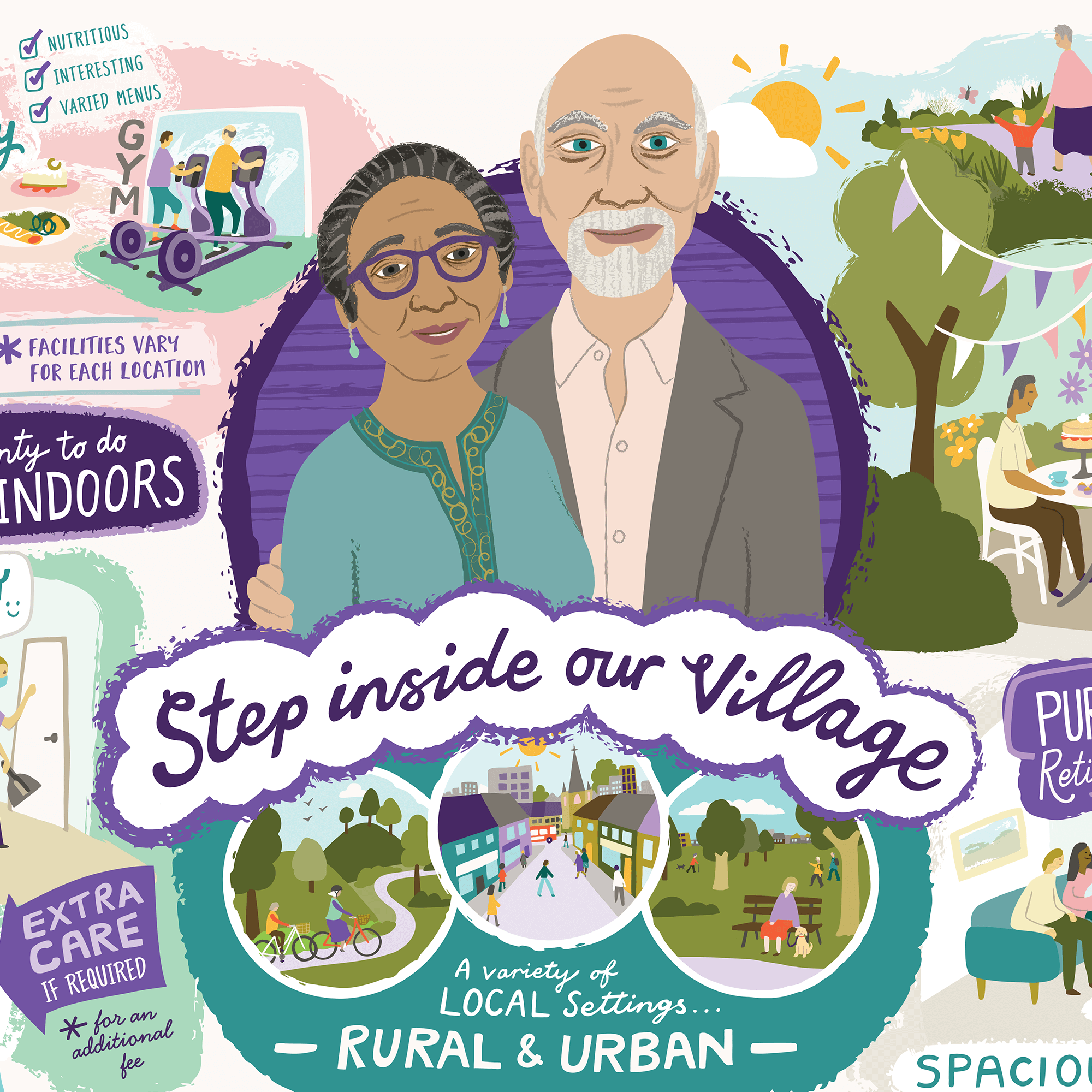
LATEST: Follow-up campaign illustration, highlighting the ‘village’ aspect of all St Monica Trust settings
OBJECTIVE
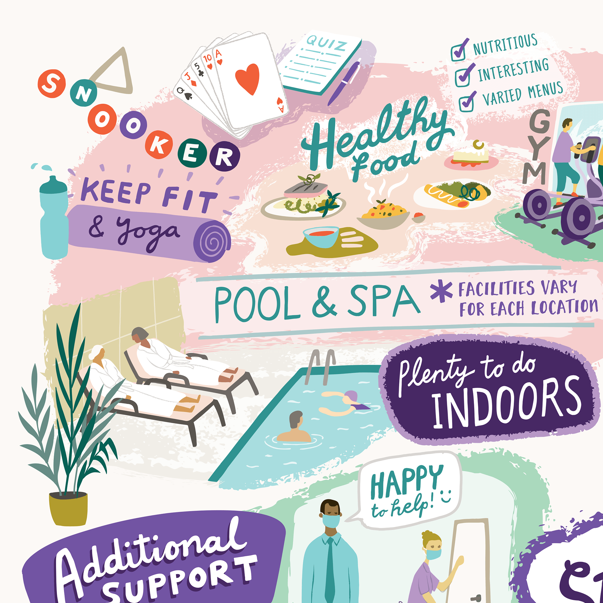
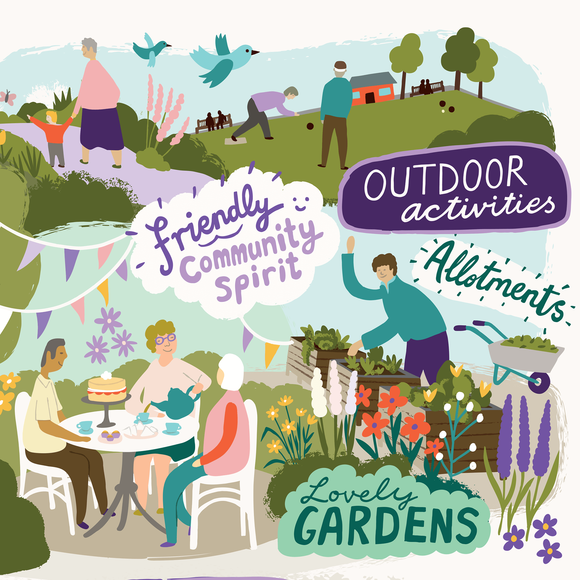
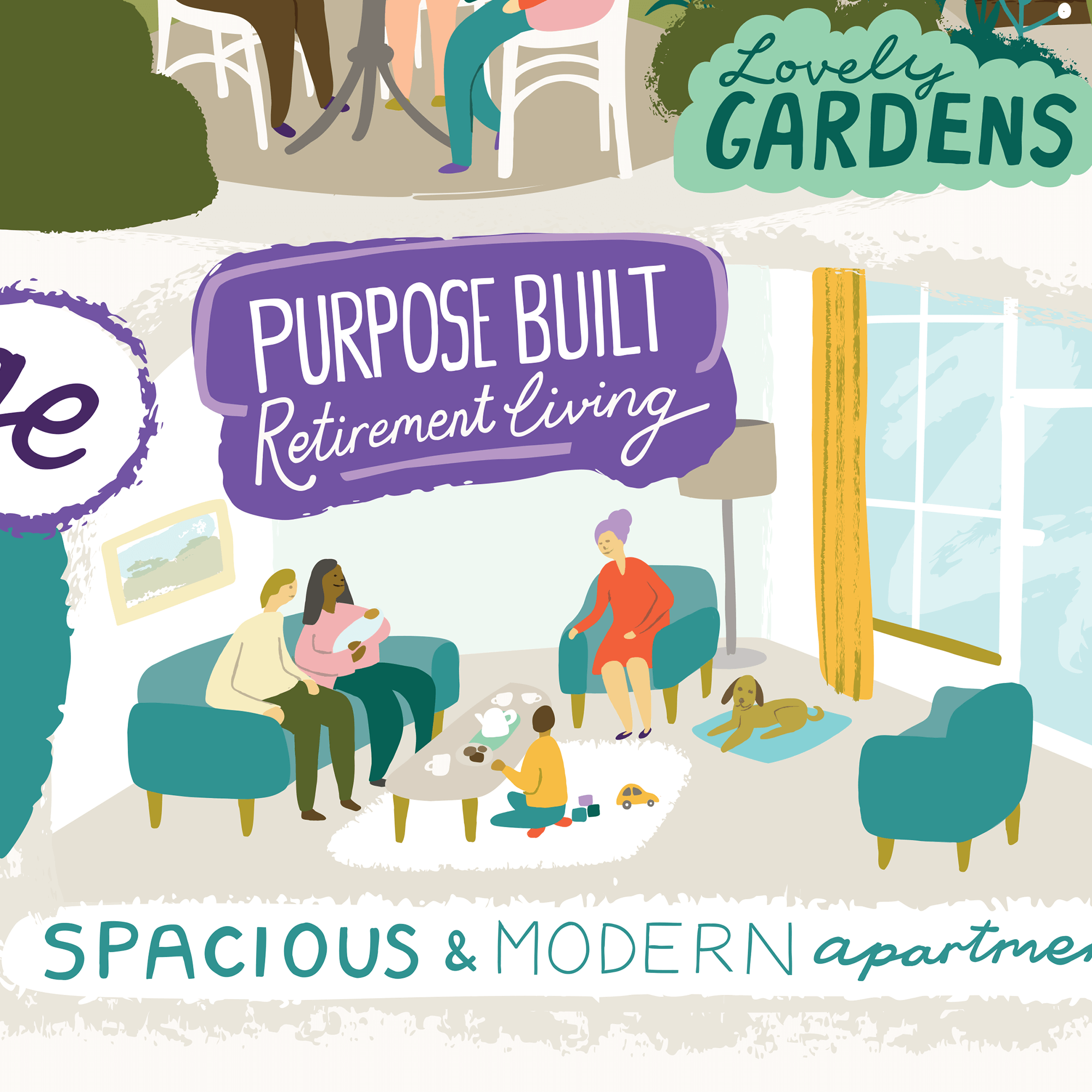
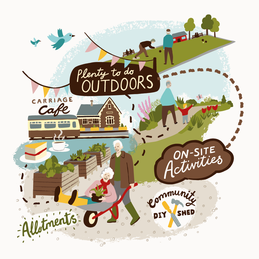
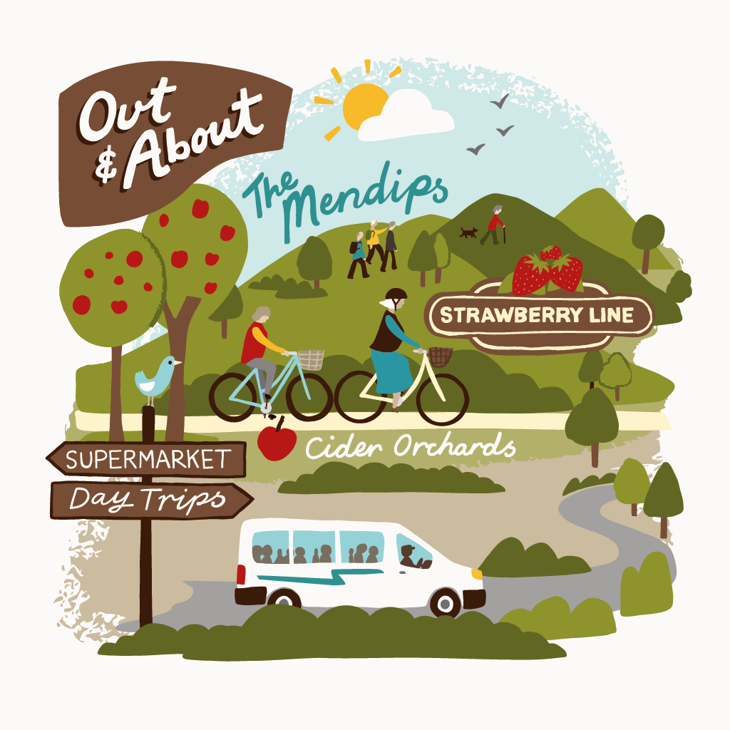
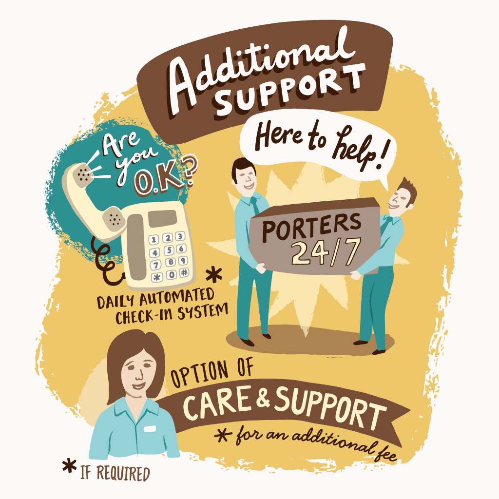
To create the lead illustration for a local press campaign for St Monica Trust, to show the range of amenities/facilities available on-site and nearby their Sandford Station site, as well as providing an example of the sort of accommodation available and additional support offered. Generally, to convey the idea that there is a lot going on!
I was briefed to include an ‘active’ retired couple central to the illustration with hand-drawn lettering and illustrative elements connected around them.
Each of the St Monica Trust retirement villages have 2 set colours specific to their individual location, for use on marketing materials & communications. For Sandford Station these are brown and cream, so I introduced a few additional complementary colours, to make the illustration more visually appealing, whilst still in-keeping with the brand.
I was later asked to create a new illustration for a follow-up campaign, showing the facilities & amenities available at all the St Monica Trust settings. This version uses different colours, incorporating the purple and green from the Trust’s primary brand palette.
Re-worked illustration to work as a vertical format
Original ad for Sandford Station
Also to be considered in the creation of the illustration, was that the image would need to be flexible enough to work in different formats - ie landscape or portrait format, for different publications.
The way I approached this was to make groupings of the different types of activities or amenities, with the potential for them to be moved around and repositioned generally as clusters, before any further adjustments if necessary.
Landscape format advertisement, with St Monica Trust logo and messaging
The new campaign, in landscape/ half page ad format
For additional flexibility, these groupings were isolated as stand-alone elements for use on social media.


The initial sketch - Worked up to show the client, for feedback and approval before proceeding to final artwork.
Part of the process for this illustration included creating the hand-drawn lettering. I am always adapting the way I work, and trialling different processes… In this instance I drew the lettering on the iPad Pro using Adobe Draw and the Apple Pencil. By working this way the lettering retains a hand-drawn feel (essentially it is hand drawn, just straight into the digital realm!) and is in vectors, which I can then open up and edit in Illustrator on the Mac. I like working in vectors as it means there is never any issue with re-sizing and scaling things up. Pictured below are all the hand lettered elements I created for use in this piece.

